The US Open Surface Speed Puzzle

Embed from Getty Images

Italian translation at settesei.it

Almost everyone agrees that the courts were slower at the US Open this year. The players thought so, the media concurred, and the tournament director confirmed that they had slightly changed the physical makeup of the surface in order to slow things down. Even clay-court wizard Dominic Thiem got within two points of the semi-finals, so clearly something changed.

I’m not going to argue with that. But when I set out to measure the change and get a sense of who might have benefited, I kept finding odd results. Almost nothing I tried revealed any clear-cut slowing of the surface, and by some metrics, the courts in Flushing played faster this year. Maybe it was just the heat and humidity–though the numbers don’t make that clear, either.

My usual starting point is my own surface-speed stat, which compares the ace rate at each tournament while controlling for the mix of servers and returners. While the dearth of advanced stats means it is limited to some basic inputs, it usually matches up quite well with our intution and doesn’t differ too much from Court Pace Index (CPI), an infrequently-available metric based on direct physical measurements. Using my algorithm, the US Open surface was 5% faster than the average surface at an ATP event in the last 52 weeks, compared to last year, when it was 4% slower. Compared to courts at the average WTA tournament, New York was 5% slower this year, versus 19% slower in 2017. The slowest tour-level surfaces (for either gender) have about 50% fewer aces than average, and the fastest have about 50% more.

2017 wasn’t just a blip, either in real-life on in my metric. It was similar to 2016, which also rated as considerably slower than this year’s surfaces. We’re left with a discrepancy that may stem from using an algorithm that relies too much on aces: Perhaps players were overwhelmed by the heat and tried more than usual to keep rallies short, or they simply didn’t bother trying to put their racket on first serves as often.

The evidence is clearer that players were more aggressive this year than in 2017. The average rally length, excluding double faults, on courts covered by Slamtracker (179 of the 254 main draw singles matches) fell from 4.28 shots last year to 4.17 this year, a drop of 2.6%. That could be affected by the changing mix of players in the draw (as well as those selected to play on higher-profile courts) so I isolated the 27 players with at least two matches worth of data from both 2017 and 2018. Those 27 saw their rally length drop a tiny bit more, about 3% from last year to this year.

We have the beginnings of an explanation. If players were showing more aggression–perhaps because the heat encouraged them to adopt more first-strike tactics–that could cancel out the effect of a slower surface. We can drill down even further using the Aggression Score (AS) metric, which measures the rate of winners and unforced errors per shot. Across all matches, AS rose from 15.3% in 2017 to 16.1% this year, an increase of 5.7%. Using the 27 players with multiple matches from both years’ tournaments, the difference is more stark, rising by 8.7%.

It’s clear that we saw more aggressive tennis at the 2018 Open than the year before. If we take for granted that the courts played faster, the case is closed: Tactics, probably heat-induced, outweighed surface. But if we approached the problem without knowing what players, media, and tournament officials said, the same numbers would unequivocally point to an even simpler conclusion, that the courts played faster.

If tactics explain our discrepancy, one more place we might look is first serves. Maybe servers took more chances, increasing their ace rate at the expense of first-serve percentage. But the data doesn’t back us up: The overall first-serve percentage in Slamtracker matches fell by a mere 0.07%. Using year-to-year comparisons for our set of 27 players, the difference was larger, but still a measly 0.3%. If tactics are the answer, it must be on the return of serve, not the serve itself.

This is where the trail runs cold. Return tactics are tougher to quantify than serving strategy, and there’s a limit to how much we can do with the available data. We can tally return winners and induced forced errors (IFEs), points in which the returner ended things with a strong reply. If returners allowed more aces, it should be because they took a more aggressive approach, trading fewer opportunities for better odds of winning when they did make contact. Instead, the record shows that return winners and IFEs fell a whopping 7% from last year to this year. That number supports the theory of a slower surface, and it meets expectations for those players who adopted very conservative return positions, such as Rafael Nadal, whose return winner/IFE rate went down by 3%, and Thiem, whose rate decreased by 7%. But a slower surface and a lower return winner/IFE rate should add up to fewer aces, not more.

Compared to where we started, we have a lot more data but not many more answers. Some signs point to a faster surface, others to a slower; some indicate more aggressive tactics, others more conservative ones. regardless of what we know about the physical makeup of the courts, there are many factors that influence what we refer to as “surface speed.” The hot, humid conditions in Flushing this year surely help complicate things–perhaps a study that took into account the heat index for each individual match would shed more light on these questions. We could also be seeing players adapt to the conditions–whether the heat or the slower surface–in different ways. Everyone may agree about how the courts played this year, but it’s much more difficult to pin down exactly what that means.

Dominic Thiem, Old-School Clay Court Specialist

Italian translation at settesei.it

With a tennis calendar tilted heavily toward hard court events, we don’t see many true clay court specialists these days. The best male players who excel on clay are forced to adapt their games to hard courts, as well: Rafael Nadal has won six majors off of clay, while Pablo Carreno Busta and Diego Schwartzman have both hoisted trophies at tour level hard court events. It’s possible to play a mostly-clay schedule at the Challenger level, but it’s nearly impossible to establish yourself as an ATP regular without winning some matches on hard courts.

Dominic Thiem is capable enough on fast surfaces, but more than any other tour player, he is considerably better on the dirt than off it. In the last 52 weeks, he has won 25 of 31 matches on clay, compared to only 24 of 42 on other surfaces. Against the top ten, he is a respectable 7-9 on clay (more impressive when you consider that 12 of the 16 matches were against the Big Four, seven of them facing Nadal, and two of the others came against Stan Wawrinka), but a dismal 2-15 on hard courts. If you, like me, had settled into thinking of Thiem as a solid but not particuarly threatening member of the top ten, you probably didn’t realize quite how bad he is on hard courts–or just how good he has become on clay.

When only clay court results are taken into consideration, Thiem rates as the second-best player on the surface. According to clay court Elo, the Austrian outranks everyone on tour except for Rafa and Novak Djokovic, whose rating reflects his skill level when he last regularly played and very likely will overstate his ability when he returns. Thiem trails Nadal by about 180 points, 2410 to 2235, implying that in a head-to-head matchup, we’d except the Austrian to win only 26% of the time. But when we compare Thiem to the rest of the pack and exclude the walking wounded–Djokovic, Wawrinka, Andy Murray, and Kei Nishikori–along with clay-skipper Roger Federer, his position looks much better. The next best clay courter, Alexander Zverev, trails Thiem by about the same margin, nearly 170 points.

A clay court Elo rating over 2200 is a useful marker of elite status. In the professional era, only 29 players have reached that level, 22 of whom can count at least one Grand Slam title to their names. Among active players, only the Big Four, Nishikori, Juan Martin del Potro, David Ferrer, and Thiem belong to the club.

Where Thiem really stands out is the juxtaposition of his clay court success and his hard court mediocrity. After his title last week in Buenos Aires, his Elo rating based only on clay court results was 2234, compared to a hard court rating of 1869. The first number, as we’ve seen, is good for third overall, second if we exclude Djokovic’s increasingly stale results; the second puts him 31st on tour, behind Schwartzman, Damir Dzumhur, and Fabio Fognini.

No one active today is more of a clay specialist–in the sense that his results on clay exceed his results on hard–than Thiem. (There are some even more extreme differences between grass and either hard or clay, but the brevity of the grass season means that many of those contrasts are due only to small samples.) The ratio of Thiem’s clay court Elo rating to his hard court rating–again, 2234 to 1869–is 1.20, far beyond any of the 44 other active players with a clay court Elo rating of 1800 or higher. Simone Bolelli comes in second, at 1.12, and a handful of players, including Nadal, register at 1.10. Here is the entire top 20:

Player                 Clay Elo  Hard Elo  Ratio
Dominic Thiem              2234      1869   1.20
Simone Bolelli             1834      1634   1.12
Rafael Nadal               2410      2182   1.10
Albert Ramos               1873      1696   1.10
Federico Delbonis          1869      1696   1.10
Pablo Carreno Busta        1921      1746   1.10
Pablo Cuevas               1873      1709   1.10
Nicolas Almagro            1903      1755   1.08
Karen Khachanov            1838      1701   1.08
Leonardo Mayer             1878      1741   1.08
Aljaz Bedene               1826      1695   1.08
David Ferrer               2017      1894   1.07
Philipp Kohlschreiber      1951      1845   1.06
Stan Wawrinka              2138      2027   1.06
Martin Klizan              1800      1709   1.05
Guido Pella                1825      1744   1.05
Borna Coric                1830      1760   1.04
Fernando Verdasco          1863      1794   1.04
Alexander Zverev           2067      1997   1.04
Feliciano Lopez            1830      1772   1.03

A few decades ago, when it was possible for top players to spend more than two or three months per year racking up points on clay courts, such lopsided ratings were a bit more common. Of the 29 men who have ever topped 2200 in clay court Elo rating, 11 have at some point recorded a ratio of 1.20 or higher. That includes Nadal, whose clay rating was 20% higher than his hard court number early in 2008, and Sergi Bruguera, whose ratio topped out at 1.29. Four other major titlists–Bjorn Borg, Juan Carlos Ferrero, Thomas Muster, and Guillermo Vilas–also exceeded 1.20 at some point during their career. To put Thiem’s specialization in context, though, consider that Guillermo Coria maxed out at 1.19 and Gustavo Kuerten peaked at 1.16. Even Ferrer–the epitome of the clay court specialist to a generation of fans–never exceeded 1.15 once his clay court Elo rating had passed the 2000-point threshold.

The category into which Thiem fits most neatly–specialists who are decidedly middle-of-the-pack on hard courts–largely belongs to an earlier era. When we lower our clay court Elo standard to a career peak of 2000 points, a mark equal to about 15th on tour right now, we’re left with a group of 145 players in the professional era. Of those, 65 (45%) were at some point as lopsided as Thiem is now, with a clay-to-hard rating ratio of at least 1.20. Yet only five of those belong to active players (Nadal, Thiem, Fognini, Pablo Cuevas, and Nicolas Almagro) and two-thirds of them came before 1995.

In some cases, players with substantially better clay court results learn to compete at a higher level on faster surfaces. Thiem is 24, and Nadal had a similar specialist’s ratio at age 22. Other former greats enjoyed early success on clay and quickly figured out hard courts as well. The Austrian may prove to be a late bloomer in that regard. That’s unlikely, but when Nadal retires or (improbable as it seems) fades, Thiem is poised to rack up titles and emerge as the greatest clay court player of his generation, regardless of whether his hard court game improves.

Unpredictable Bounces, Predictable Results

Italian translation at settesei.it

These days, the grass court season is the awkward stepchild of the tennis calendar. It takes place almost entirely within a single country’s borders, lasts barely a month, and often suffers from the absence of top players who prefer to rest after the French Open.

The small number of grass court events makes the surface problematic for analysts, as well. The surface behaves differently than hard or clay courts and rewards certain playing styles, so it’s reasonable to assume that many players will be particularly good or bad on grass. But with 90% of tour-level matches contested on other surfaces, many players don’t have much of a track record with which we can assess their grass-court prowess.

I was surprised, then, to find that grass court results are rather predictable. Elo-based forecasts of ATP grass court matches are almost as accurate as hard court predictions and considerably more effective than clay court forecasts. Even when we use “pure” surface forecasts–that is, predicting matches using ratings which draw only on results from that surface–grass court forecasts are a bit better than clay court predictions.

I started with a dataset of the roughly 50,000 ATP matches from 2000 through last week, excluding retirements and withdrawals. As a benchmark, I used official ATP rankings to make predictions for each of those matches. 66.6% of them were right, and the Brier score for ATP rankings over that span is .210. (Brier score measures the accuracy of a set of forecasts by averaging the squared error of each individual forecast, so a lower number is better. To put tennis-specific Brier scores in context, in 2016, ATP rankings had a .208 Brier score, and aggregate betting odds had a .189 Brier score.)

Let’s break that down by surface and compare the performance of ATP rankings, Elo, and surface-specific Elo. “F%” is the percentage of matches won by the favorite–as determined by that system, and “Br” is Brier score:

Surface  ATP F%  ATP Br  Elo F%  Elo Br  sElo F%  sElo Br  
Hard      67.3%   0.207   68.0%   0.205    68.5%    0.202  
Clay      66.1%   0.211   67.1%   0.211    67.0%    0.213  
Grass     66.0%   0.215   67.6%   0.207    68.5%    0.207

All three rating systems do best on hard courts, and for good reason: official rankings and overall Elo are more heavily weighted toward hard court results than they are clay or grass. Surface-specific Elo does best on hard courts for a similar reason: more data.

Already, though, we can see the unexpected divergence of clay and grass courts, especially with surface-specific Elo. It’s possible to explain overall Elo’s better performance on grass courts due to the presumed similarly between hard and grass–if a player excels on one, he’s probably good on the other, even if he’s horrible on clay.  But that doesn’t explain sElo doing better on grass than on clay. There are 3.3 times as many tour-level matches on clay than on grass, so even allowing for the fact that players choose schedules to suit their surface preferences, almost everyone is going to have more results on dirt than on turf. More data should give us better results, but not here.

We can improve our forecasts even more by blending surface-specific ratings with overall ratings. After testing a wide range of possible mixes, it turns out that equally weighting Elo and sElo provides close to the best results. (The differences between, say, 60/40 and 50/50 are extremely small on all surfaces, so even where 60/40 is a bit better, I prefer to keep it simple with a half-and-half mix.) Here are the results for weighted surface Elos for all three surfaces:

Surface  ATP F%  ATP Br  
Hard      68.6%   0.202  
Clay      68.0%   0.207  
Grass     69.8%   0.196

Now grass courts are the most predictable of the major surfaces! Even when we use a weighted average of Elo and sElo, grass court forecasts rely on less data than those of the other surfaces–the surface-specific half of the grass court forecasts uses less than one-third the match results of clay court predictions and less than one-fifth the results of hard court forecasts. In fact, we can do at least as well–and perhaps a tiny bit better–with even less data: A 50/50 weighting of grass-specific Elo and hard-specific Elo is just as accurate as the half-and-half mix of grass-specific and overall Elo.

Regardless of the exact formula, it remains striking that we can predict ATP grass court results so accurately from such limited data. Even if one-third of ATP events were played on grass, I still wouldn’t have been surprised if grass court results turned out to be the least predictable. The more a surface favors the server–and it’s hardest to break on grass–the tighter the scoreline will tend to be, introducing more randomness into the end result. Despite that structural tendency, we’re able to pick winners as successfully on grass as on the more common surfaces.

Here’s my theory: Even though there aren’t many grass court events, the conditions at those few tournaments are quite consistent. Altitude is roughly sea level, groundskeepers follow the lead of the staff at Wimbledon, and rain clouds are almost always in sight. Compare that homogeneity to the variety of hard courts or clay courts. The high-altitude hard courts in Bogota are nothing like the slow ones in Indian Wells. The “clay” in Houston is only nominally equal to the crushed brick of Roland Garros. While grass courts are almost identical to each other, clay courts are nearly as different from each other as they are from other surfaces.

It makes sense that ratings based on a uniform surface would be more accurate than ratings based on a wide range of surfaces, and it’s reassuring to find that the limited available data doesn’t cancel out the advantage. This research also suggests a further path to better forecasts: grouping hard and clay matches by a more precise measure of surface speed. If 10% of tour matches are sufficient to make accurate grass court predictions, the same may be true of the slowest one-third of clay courts. More data is almost always better, but sometimes, precisely targeted data is best of all.

The Proud Tradition of Americans Skipping Monte Carlo

Italian translation at settesei.it

The Monte Carlo Masters is unique among the ATP’s 1,000 series events. The stakes are high, but attendance isn’t mandatory, so while most of the game’s top players show up, a few take the week off. No group has so consistently skipped Monte Carlo than players from the U.S.A.

This year, six U.S. players had rankings that would’ve gotten them into the Monte Carlo main draw, where winning a single match earns you 45 ranking points and just over €28,000 in prize money. Five of those players–including John Isner, who reached the third round two years ago and won a pair of tough Davis Cup matches at the same venue–opted out. All five played the 250-level Houston tournament last week instead. Only Ryan Harrison made the trip to Europe–losing in the opening round, as Carl Bialik and I safely predicted on this week’s podcast.

Choosing the low-stakes event on home soil isn’t the wise choice, but it’s nothing new. Since 2006, only seven Americans have appeared in a Monte Carlo main draw: Isner twice, Harrison, Sam Querrey, Donald Young, Steve Johnson, and Denis Kudla, who qualified in 2015. From 2006 to 2016, 7 of the 11 Monte Carlo draws were entirely USA-free. In the same time span, Houston draws have featured 35 Americans ranked in the top 60–all players who probably would have earned direct entry in the higher-stakes clay event, as well.

For a player like Isner or Jack Sock, an April schedule can handle both tournaments. Four of the seven Americans who went to Monte Carlo played Houston as well, including Querrey in 2008, when he lost in the first round in Houston but reached the final eight in Monte Carlo.

Most U.S. players, including just about everyone I’ve mentioned so far, would much rather play on hard courts than on clay.  (The Houston surface is more conducive to aggressive, first-strike tennis than is the Monte Carlo dirt, one of the slowest surfaces on the calendar.) However, as Isner and Querrey have shown, a one-dimensional power game can succeed on a slow court, even if it looks nothing like the strategy of a traditional clay specialist.

Isner, in particular, has racked up plenty of points on the surface. While he’d much rather play on home soil, he has twice reached the fourth round at the French Open and pushed none other Rafael Nadal to a deciding set in both Paris and Monte Carlo. Sock is also a threat on the surface, having won nearly two-thirds of his tour-level matches on clay. Many of those wins came in Houston, but like Isner, he took a set from Nadal in Europe on the surface the Spaniard typically dominates.

Even if the top Americans had little chance of going deep in Monte Carlo, one wonders what the additional time on the surface would do for the rest of their clay season. Most will show up for Madrid and Rome, and all of them will play Roland Garros. It’s a bit of a chicken-and-egg question–do Americans avoid the dirt because they suck on clay, or do they suck because they avoid it?–but it couldn’t hurt to play on the more traditional European surface against elite-level opponents.

The difference in rewards between a 250 like Houston and a Masters 1000 like Monte Carlo make it likely that the risk of playing in unfamiliar territory would pay off, as it did for Querrey in his one trip and for Isner two years ago. And I suspect that the rewards would stretch beyond the immediate shot at a bigger payday: If someone like Sock invested more time in developing his clay-court game now, he could become a legitimate threat at a faster clay tournament (such as the Madrid Masters) in a few years. It’s probably too late for the likes of Querrey, but the next generation of U.S. men’s stars would do well to break with tradition and give themselves more chances to excel on the dirt.

The Speed of Every Surface, 2016 Edition

More than five years after I first started trying to use ATP match stats to estimate surface speed, the issue remains a contentious one. Most commentators agree that surface speeds have converged and generally gotten slower. The ATP has begun to release a trickle of court speed data, but it raises more questions than answers.

It’s been three years since I’ve published surface speed numbers, so we’re due for an update. Before we do that, it’s important to understand what exactly these figures mean, as well as their limitations.

Court surfaces–and, more broadly, the environments in which pro matches are played–have a variety of characteristics. Some courts are faster or slower and some cause higher or lower bounces. Tournaments use different balls, are played at a range of elevations, and take place in all sorts of weather conditions. All of these factors, and more, affect how matches are played.

Due to the limits of available tennis data, however, we can’t isolate those different factors. It would be great to know which surfaces allowed for the most effective slice approaches or the deadliest drop shots, but we don’t have the data to even begin trying to answer those questions. The Match Charting Project is a step in the right direction, but with only a few hundred men’s matches per year, there isn’t quite enough to compare surfaces while controlling for different players and playing styles.

So we work with what we have. Faster surfaces are more favorable to the server, which shows up in ace counts and service breaks. The ATP publishes those basic stats for every match, so that’s what we’ll use. When I first researched this issue, I discovered that there isn’t much difference between counting aces and counting service breaks, except that there’s a wider variation in ace rates between faster and slower surfaces, so the resulting numbers are easier to understand.

At the risk of repeating myself: Measuring surface speed by ace rate ignores a lot of court characteristics. It is far from complete and certainly imperfect. It does, however, give us an idea of how tournaments compare in one important regard.

Aces, adjusted

That said, simply counting aces–for example, 6.8% of points in Buenos Aires this year and 11.2% of points in Los Cabos–isn’t good enough. Players make scheduling choices based on their strengths and preferences, so the guys who show up for clay court events tend, on average, to be weaker servers than those who play on hard and grass courts. To take an extreme example, Gilles Muller managed to play only two matches on clay this season. As it turns out, the courts in Buenos Aires and Los Cabos had almost identical effects on ace rates–the difference is entirely due to the mix of players in each draw.

So we adjust for the makeup of the field. For every player with at least three tour-level matches on clay and another three on hard or grass, I calculated their season average ace rates on clay and hard/grass,which I then weighted (one-third clay, two-thirds hard/grass) so that the numbers give us idea of what their ace rate would’ve been had they played an “average” (that is, unbiased by scheduling preferences) season. I’ve lumped hard and grass together here, not because they are the same–of course they’re not–but because the small number of grass court events makes it difficult to treat on its own.

With player averages in hand, we can go through every match of the season (between players who meet our minimums) and, using their ace rates and the rates at which players hit aces against them, calculate a “predicted” ace rate for the match, given a neutral surface. Then, by comparing the match’s actual ace rate to the neutral prediction, we get one data point regarding the surface’s effect on aces. If the actual ace rate is greater than the prediction, it suggests the surface is faster than average. If the prediction is greater than the ace rate, it implies the surface is slower than average.

No single match can tell us about a court’s tendency, but by aggregating all the matches at an event, we get a fairly good idea. With that final step, we get a single number per event. A neutral surface rates at 1, faster surfaces are greater than 1, and slower surfaces are less than 1. For instance, this algorithm rates the 2016 Paris Masters as 1.18, meaning that there were 18% more aces than we would expect on a neutral surface, rating Bercy as faster than all but 10 other events this season.

Whew! Here are the ace-based surface ratings for the last three seasons of every current tour-level event listed from fastest to slowest:

Tournament            Surface  2016 Ace%  2016  2015  2014  
Shenzhen                 Hard      12.9%  1.54  1.20  1.49  
Quito                    Clay      11.9%  1.50  0.89        
Metz                     Hard      12.6%  1.43  1.28  1.37  
Marseille                Hard      15.3%  1.38  1.28  1.26  
Stuttgart               Grass      13.3%  1.38  1.32  0.89  
Chengdu                  Hard      11.7%  1.27              
Australian Open          Hard      12.3%  1.25  1.19  1.12  
Queen's Club            Grass      14.3%  1.25  1.27  1.26  
Washington               Hard      19.5%  1.24  1.12  1.25  
Cincinnati Masters       Hard      14.2%  1.18  1.04  1.17  
Paris Masters            Hard      13.7%  1.18  1.03  1.03  
Brisbane                 Hard      12.2%  1.16  1.20  1.23  
Canada Masters           Hard      12.6%  1.16  1.08  1.00  
Halle                   Grass      12.2%  1.16  1.12  1.31  
Nottingham              Grass      12.0%  1.15  1.21        
Gstaad                   Clay      10.1%  1.12  0.84  0.77  
Basel                    Hard      10.1%  1.12  1.01  1.20  
Tokyo                    Hard      11.5%  1.12  1.00  1.06  
Chennai                  Hard      10.3%  1.12  0.91  0.65  
Auckland                 Hard      12.9%  1.11  1.21  1.01  
                                                            
Tournament            Surface  2016 Ace%  2016  2015  2014  
Doha                     Hard       8.8%  1.11  1.06  0.83  
Sydney                   Hard      10.5%  1.11  1.32  1.27  
Montpellier              Hard       9.7%  1.10  1.29  1.29  
Shanghai Masters         Hard      10.7%  1.10  1.05  1.34  
Kitzbuhel                Clay       6.9%  1.09  0.85  0.81  
s-Hertogenbosch         Grass      13.2%  1.08  1.06  1.05  
Winston-Salem            Hard      10.4%  1.07  1.33  1.10  
Newport                 Grass      11.0%  1.07  1.26  1.23  
Tour Finals              Hard       9.5%  1.06  0.99  0.89  
Wimbledon               Grass      11.8%  1.06  1.20  1.35  
Rotterdam                Hard       9.8%  1.04  1.19  1.08  
Vienna                   Hard      11.8%  1.02  1.39  1.26  
Memphis                  Hard       8.7%  1.00  1.19  0.94  
Miami Masters            Hard      10.0%  1.00  0.86  1.04  
Sofia                    Hard       8.4%  1.00              
Beijing                  Hard       9.4%  0.99  1.05  0.81  
Atlanta                  Hard      15.5%  0.97  1.35  0.90  
St.Petersburg            Hard       8.1%  0.97  0.98        
Marrakech                Clay       8.5%  0.95              
Olympics                 Hard       7.1%  0.95              
                                                            
Tournament            Surface  2016 Ace%  2016  2015  2014  
Moscow                   Hard       6.6%  0.94  1.08  1.12  
Antwerp                  Hard       8.6%  0.93              
Delray Beach             Hard       9.2%  0.92  0.88  0.93  
US Open                  Hard       8.9%  0.91  1.10  1.10  
Dubai                    Hard       9.4%  0.88  0.93  0.81  
Madrid Masters           Clay       8.6%  0.86  0.85  0.94  
Los Cabos                Hard      11.2%  0.85              
Buenos Aires             Clay       6.8%  0.85  0.78  0.64  
Houston                  Clay      11.5%  0.84  0.76  0.70  
Sao Paulo                Clay       7.1%  0.83  1.03  1.20  
Acapulco                 Hard      10.5%  0.83  0.67  0.98  
Indian Wells Masters     Hard       8.2%  0.83  0.99  0.90  
Stockholm                Hard       7.6%  0.82  1.13  1.15  
Rio de Janeiro           Clay       7.4%  0.81  0.80  0.77  
Estoril                  Clay       7.4%  0.80  0.63  0.62  
Nice                     Clay       6.3%  0.79  0.64  0.74  
Geneva                   Clay       8.3%  0.77  0.78        
Umag                     Clay       5.4%  0.77  0.67  0.76  
Roland Garros            Clay       7.6%  0.77  0.72  0.71  
Rome Masters             Clay       7.2%  0.76  0.94  0.74  
Bucharest                Clay       5.9%  0.71  0.59  0.51  
Munich                   Clay       6.3%  0.71  1.01  0.87  
Monte Carlo Masters      Clay       6.2%  0.70  0.63  0.64  
Istanbul                 Clay       5.7%  0.67  0.83        
Barcelona                Clay       5.4%  0.65  0.70  0.72  
Bastad                   Clay       5.3%  0.65  0.64  1.07  
Hamburg                  Clay       5.7%  0.60  0.62  0.79

As usual, we have an interesting mix of usual suspects and surprises. The top of the list is primarily indoor hard and grass courts, along with the high-altitude clay in Quito and Gstaad. However, in both of the latter cases, those tournaments had lower-than-expected ace rates in 2015. The surface ratings for 250s are particularly volatile because, in addition to the small number of matches, many of these matches must be discarded because one or both of the players didn’t meet our minimums. For the 2015 Quito event, we have only 11 matches to work with.

The sample size problem doesn’t apply to larger events, however, so we can have a fair amount of confidence in the ratings for the Australian Open, showing up here as the fastest of the Grand Slams–considerably faster than Wimbledon, which is only a few ticks above neutral.

Ace ratings and Court Pace Index

Last month, TennisTV released some data on court speed for this season’s Masters events. Court Pace Index (CPI) is a commonly-accepted measure of the speed of the surface itself–that is, the physical makeup of the court. As I’ve said, that’s far from the only factor affecting how a court plays, but it is an important one.

cpi2

Here’s how my surface ratings compare to CPI:

Tournament            Surface  TA Rating   CPI  
Cincinnati Masters       Hard       1.18  35.1  
Paris Masters            Hard       1.18  39.1  
Canada Masters           Hard       1.16  35.2  
Shanghai Masters         Hard       1.10  44.1  
Tour Finals              Hard       1.06  40.6  
Miami Masters            Hard       1.00  33.1  
Madrid Masters           Clay       0.86  22.5  
Indian Wells Masters     Hard       0.83  30.0  
Rome Masters             Clay       0.76  24.0  
Monte Carlo Masters      Clay       0.70  23.7

It’s noteworthy that Madrid is, by my measure, the most ace-friendly of the three clay-court Masters, while its CPI is the lowest. Altitude could account for the difference.

The biggest mismatch, though, is the Tour Finals. The O2 Arena has one of the highest CPIs, but it doesn’t rate very far above average in aces. The Tour Finals has always been a bit problematic, as there is an unusually small number of matches, and the level of returning is very, very high. My algorithm takes into account how well each player prevents aces, but perhaps that issue is more complex when our view is limited to only the very best players.

TennisTV also showed CPI for the last several years of Tour Finals:

cpi1

Compared to my ratings:

Year  TA Rating   CPI  
2016       1.06  40.6  
2015       0.99  34.0  
2014       0.89  33.6  
2013       0.90  32.8  
2012       1.18  33.9

If the table cut off after 2013, it would look like a relatively good fit. As it is, the relationship between CPI and my rating for 2012 wouldn’t be out of place in the previous table, which included a 35.1 CPI for Cincinnati to go with an ace-based rating of 1.18.

I hope that this is a sign of more data to come. If so, we can move beyond approximations based on ace rate to get a better sense of what factors influence play at the ATP level. More data won’t settle the age-old surface speed debates, but it will make them a whole lot more interesting.

The Grass is Slowing: Another Look at Surface Speed Convergence

Italian translation at settesei.it

A few years ago, I posted one of my most-read and most-debated articles, called The Mirage of Surface Speed Convergence.  Using the ATP’s data on ace rates and breaks of serve going back to 1991, it argued that surface speeds aren’t really converging, at least to the extent we can measure them with those two tools.

One of the most frequent complaints was that I was looking at the wrong data–surface speed should really be quantified by rally length, spin rate, or any number of other things. As is so often the case with tennis analytics, we have only so much choice in the matter. At the time, I was using all the data that existed.

Thanks to the Match Charting Project–with a particular tip of the cap to Edo Salvati–a lot more data is available now. We have shot-by-shot stats for 223 Grand Slam finals, including over three-fourths of Slam finals back to 1980. While we’ll never be able to measure anything like ITF Court Pace Rating for surfaces thirty years in the past, this shot-by-shot data allows us to get closer to the truth of the matter.

Sure enough, when we take a look at a simple (but until recently, unavailable) metric such as rally length, we find that the sport’s major surfaces are playing a lot more similarly than they used to. The first graph shows a five-year rolling average* for the rally length in the men’s finals of each Grand Slam from 1985 to 2015:

mens_finals_rallies

* since some matches are missing, the five-year rolling averages each represent the mean of anywhere from two to five Slam finals.

Over the last decade and a half, the hard-court and grass-court slams have crept steadily upward, with average rally lengths now similar to those at Roland Garros, traditionally the slowest of the four Grand Slam surfaces. The movement is most dramatic in the Wimbledon grass, which for many years saw an average rally length of a mere two shots.

For all the advantages of rally length and shot-by-shot data, there’s one massive limitation to this analysis: It doesn’t control for player. (My older analysis, with more limited data per match, but for many more matches, was able to control for player.) Pete Sampras contributed to 15 of our data points, but none on clay. Andres Gomez makes an appearance, but only at Roland Garros. Until we have shot-by-shot data on multiple surfaces for more of these players, there’s not much we can do to control for this severe case of selection bias.

So we’re left with something of a chicken-and-egg problem.  Back in the early 90’s, when Roland Garros finals averaged almost six shots per point and Wimbledon finals averaged barely two shots per point, how much of the difference was due to the surface itself, and how much to the fact that certain players reached the final? The surface itself certainly doesn’t account for everything–in 1988, Mats Wilander and Ivan Lendl averaged over seven shots per point at the US Open, and in 2002, David Nalbandian and Lleyton Hewitt topped 5.5 shots per point at Wimbledon.

Still, outliers and selection bias aside, the rally length convergence we see in the graph above reflects a real phenomenon, even if it is amplified by the bias. After all, players who prefer short points win more matches on grass because grass lends itself to short points, and in an earlier era, “short points” meant something more extreme than it does today.

The same graph for women’s Grand Slam finals shows some convergence, though not as much:

womens_finals_rallies

Part of the reason that the convergence is more muted is that there’s less selection bias. The all-surface dominance of a few players–Chris Evert, Martina Navratilova, and Steffi Graf–means that, if only by historical accident, there is less bias than in men’s finals.

We still need a lot more data before we can make confident statements about surface speeds in 20th-century tennis. (You can help us get there by charting some matches!) But as we gather more information, we’re able to better illustrate how the surfaces have become less unique over the years.

The Speed of Every 2013 Surface

Few debates get tennis fans as riled up as the general slowing–or homogenization–of surface speeds.  While indoor tennis (to take a recent example) is a different animal than it was fifteen or twenty years ago, it’s tough to separate the effect of the court itself from the other changes in the game that have taken place in that time.

Further, the “court effect” itself is multi-dimensional.  The surface makes a big difference, as grass will almost always play quicker than a hard court, which will usually play faster than clay.  But as we’ve seen with the persistence of Sao Paulo as one of the fastest-playing events on tour, altitude is a major factor, as is weather, which can slow down a normally speedy tournament, as was the case with Hurricane Irene at the 2011 US Open.  The choice of balls can influence the speed of play as well.

With all of these factors in play, what we often refer to as “surface speed” is really “court speed” or even “playing environment.”  It’s not just the surface.  That said, I’ll continue to use the terms interchangeably.

Because of there is only limited data available, if we want to quantify surface differences,  we must use a proxy for court speed.  What has worked in the past is ace rate–adjusted for the server and returner in each match.  On a fast court–a surface that doesn’t grip the ball; or one like grass with a low, less predictable bounce; or at a high altitude; or in particularly hot weather–a player who normally hits 5% of his service points for aces might see that number increase to 8%.  (Returners influence ace rate as well. A field with Andy Murray will allow fewer aces than a field with Juan Martin del Potro, so I’ve controlled for that as well.)

Aggregate these server- and returner-adjusted ace rates, and at the very least, we have an approximation of which courts on tour are most ace-friendly.  Since most of the characteristics of an ace-friendly court overlap with what we consider to be a fast court, we can use that number as an marker for surface speed.

2013 Court Speed Numbers

For the second year in a row, the high-altitude clay of Sao Paulo was the fastest-playing surface on tour.  The altitude also appears to play a role in making Gstaad quicker than the typical clay.

As for the slowing of indoor courts, the evidence is inconclusive.  The O2 Arena, site of the World Tour Finals, rated as slower than average in 2011 and 2012, on a level with some of the slowest hard courts on tour.  This year, it came out above average, and a three-year weighted average puts the O2 at the exact middle of the ATP court-speed range.

Valencia and the Paris Masters played about as fast as they have in the past, while Marseille remained near the top of the rankings. If there is evidence for a mass slowing of indoor speeds, it comes from some unlikely sources: Both Moscow and San Jose were among the quickest surfaces on tour in 2010 and 2011, but have been right in the middle of the pack for the last two years.

The table below shows the relative ace rate of every tournament for the last four years, along with a weighted averaged of the last three years.  The weighted average is the most useful number here, especially for the smaller 28- and 32-player events.  The limited extent of a 31-match tournament can amplify the anomalous performance of one player–as you can see from some of the bigger year-to-year movements.  But over the course of three years, individual outliers have less impact.

The “Sf” column is each event’s surface: “C” for clay, “H” for hard, and “G” for grass.  The numbers are multipliers, so Sao Paulo’s three-year weighted average of 1.58 means that players at that event hit 58% more aces than they would have on a neutral court.  Monte Carlo’s 0.67 means 33% less than neutral.

Event            Sf  10 A%  11 A%  12 A%  13 A%   3yr  
Sao Paulo        C    1.44   1.08   1.58   1.74  1.58  
Marseille        H    1.09   1.24   1.41   1.26  1.30  
Halle            G    1.20   1.39   1.26   1.20  1.25  
Wimbledon        G    1.36   1.18   1.24   1.25  1.24  
Shanghai         H    0.96   1.05   1.08   1.37  1.22  
Montpellier      H    1.28          1.40   1.16  1.21  
Brisbane         H    1.01   1.20   1.08   1.27  1.19  
Tokyo            H    1.35   0.98   1.17   1.26  1.18  
Gstaad           C    0.87   1.13   0.90   1.35  1.16  
Winston-Salem    H           1.20   1.10   1.18  1.16  

Chennai          H    0.75   0.77   1.21   1.25  1.16  
Valencia         H    1.02   1.10   1.12   1.19  1.15  
Zagreb           H    1.09   1.16   1.20   1.11  1.15  
Washington       H    0.96   0.93   1.34   1.10  1.15  
Vienna           H    1.42   1.22   1.01   1.19  1.14  
Santiago         C    1.23   1.21   0.86   1.29  1.13  
Sydney           H    1.08   1.14   0.94   1.25  1.13  
Atlanta          H    0.92   0.82   1.06   1.26  1.12  
Eastbourne       G    1.07   1.13   0.92   1.22  1.11  
Queen's Club     G    1.07   1.13   1.09   1.12  1.11  

Paris            H    1.38   0.97   1.16   1.12  1.11  
Cincinnati       H    1.09   1.02   1.08   1.13  1.10  
s-Hertogenbosch  G    1.13   1.08   1.03   1.15  1.10  
Auckland         H    1.01   1.08   1.06   1.12  1.09  
Memphis          H    1.08   1.12   0.95   1.09  1.05  
Stuttgart        C    1.09   1.05   1.04   1.06  1.05  
Bogota           H                         1.09  1.05  
Rotterdam        H    0.88   1.21   0.83   1.12  1.04  
Stockholm        H    0.93   0.96   1.15   0.99  1.04  
Basel            H    0.98   1.05   1.16   0.96  1.04  

Bangkok          H    1.20   1.12   0.73   1.19  1.03  
Australian Open  H    0.98   1.10   0.92   1.08  1.03  
US Open          H    1.14   0.93   1.06   1.04  1.03  
San Jose         H    1.21   1.23   0.96   0.99  1.02  
Moscow           H    1.28   1.12   1.01   0.99  1.02  
Dubai            H    1.13   1.07   1.14   0.92  1.02  
Doha             H    0.88   1.29   0.90   0.98  1.00  
Tour Finals      H    1.07   0.93   0.87   1.11  1.00  
Beijing          H    1.01   1.01   1.06   0.94  0.99  
Canada           H    0.99   1.02   1.04   0.95  0.99  

Madrid           C    0.76   0.86   1.19   0.89  0.98  
Kitzbuhel        C           1.12   0.70   1.12  0.98  
Metz             H    1.14   0.96   1.07   0.90  0.97  
Dusseldorf       C                         0.92  0.96  
Munich           C    0.77   0.82   0.91   0.97  0.92  
St. Petersburg   H    1.02   0.84   0.86   0.99  0.92  
Acapulco         C    0.88   0.89   1.06   0.84  0.92  
Delray Beach     H    0.98   1.07   0.92   0.85  0.91  
Newport          G    1.46   0.72   1.04   0.89  0.91  
Kuala Lumpur     H    0.96   0.97   0.81   0.94  0.90  

Miami            H    0.91   0.98   0.86   0.89  0.89  
Umag             C    0.56   0.74   0.67   1.04  0.87  
Hamburg          C    1.04   0.85   0.75   0.92  0.85  
Buenos Aires     C    0.84   0.86   0.93   0.74  0.82  
Indian Wells     H    0.92   0.90   0.86   0.77  0.82  
Roland Garros    C    0.82   0.86   0.81   0.78  0.81  
Barcelona        C    0.73   0.65   0.91   0.78  0.80  
Casablanca       C    0.82   0.91   0.77   0.75  0.79  
Estoril          C    0.62   0.73   0.79   0.71  0.74  

Houston          C    0.85   0.71   0.71   0.77  0.74  
Bucharest        C    0.61   1.08   0.62   0.68  0.73  
Rome             C    0.78   0.67   0.64   0.81  0.73  
Nice             C    0.88   0.84   0.79   0.64  0.72  
Bastad           C    0.93   0.74   0.86   0.58  0.70  
Monte Carlo      C    0.63   0.60   0.71   0.67  0.67

If Surfaces are Converging…

Internet discussion has perked up about a post of mine from last month, The Mirage of Surface Speed Convergence.

Many people don’t like my results, and plenty of people just don’t like having someone challenge their preconceived notions–or those of the players they idolize.

Yet for all the chatter, no one has even attempted to address the question at the end of that post:

If surfaces are converging, why is there a bigger difference in aces now than there was 10, 15, or 20 years ago? Why don’t we see hard-court break rates getting any closer to clay-court break rates?

Unless there is a valid answer to those questions, it really doesn’t matter how you felt after watching the Miami final, or what a top player said in some press conference.

The Mirage of Surface Speed Convergence

Italian translation at settesei.it

Rafael Nadal won Indian Wells. Roger Federer won on the blue clay. Even Alessio Di Mauro won a match on a hard court last week.

That’s just a sliver of the anecdotal evidence for one of the most common complaints about contemporary ATP tennis: Surface speeds are converging. Hard courts used to play faster, allowing for more variety in the game and providing more opportunities to different types of players. Or so the story goes.

This debate skipped the stage of determining whether the convergence is actually happening. The media has moved straight to the more controversial subject of whether it should. (Coincidentally, it’s easier to churn out columns about the latter.)

We can test these things, and we’re going to in a minute.  First, it’s important to clarify what exactly we mean by surface speed, and what we can and cannot learn about it from traditional match statistics.

There are many factors that contribute to how fast a tennis ball moves through the air (altitude, humidity, ball type) and many that affect the nature of the bounce (all of the same, plus surface). If you’re actually on court, hitting balls, you’ll notice a lot of details: how high the ball is bouncing, how fast it seems to come off of your opponent’s racket, how the surface and the atmosphere are affecting spin, and more.  Hawkeye allows us to quantify some of those things, but the available data is very limited.

While things like ball bounce and shot speed can be quantified, they haven’t been tracked for long enough to help us here.  We’re stuck with the same old stats — aces, serve percentages, break points, and so on.

Thus, when we talk about “surface speed” or “court speed,” we’re not just talking about the immediate physical characteristics of the concrete, lawn, or dirt.  Instead, we’re referring to how the surface–together with the weather, the altitude, the balls, and a handful of other minor factors–affects play.  I can’t tell you whether balls bounced faster on hard courts in 2012 than in 1992.  But I can tell you that players hit about 25% more aces.

Quantifying the convergence

In what follows, we’ll use two stats: ace rate and break rate.  When courts play faster, there are more aces and fewer breaks of serve.  The slower the court, the more the advantage swings to the returner, limiting free points on serve and increasing the frequency of service breaks.

To compare hard courts to clay courts, I looked for instances where the same pair of players faced off during the same year on both surfaces.  There are plenty–about 100 such pairs for each of the last dozen years, and about 80 per year before that, back to 1991.  Focusing on these head-to-heads prevents us from giving too much weight to players who play almost exclusively on one surface.  Andy Roddick helped increase the ace rate and decrease the break rate on hard courts for years, but he barely influences the clay court numbers, since he skipped so many of those tournaments.

Thus, we’re comparing apples to apples, like the matches this year between David Ferrer and Fabio Fognini.  On clay, Ferrer aced Fognini only once per hundred service points; on hard, he did so six times as often.  Any one matchup could be misleading, but combine 100 of them and you have something worth looking at.  (This methodology, unfortunately, precludes measuring grass-court speed.  There simply aren’t enough matches on grass to give us a reliable sample.)

Aggregate all the clay court matches and all the hard court matches, and you have overall numbers that can be compared.  For instance, in 2012, service breaks accounted for 22.0% of these games on clay, against 20.5% of games on hard.  Divide one by the other, and we can see that the clay-court break rate is 7.4% higher than its hard-court counterpart.

That’s one of the smallest differences of the last 20 years, but it’s far from the whole story.  Run the same algorithm for every season back to 1991 (the extent of available stats), and you have everything from a 2.8% difference in 2002 to a 32.8% difference in 2003.  Smooth the outliers by calculating five-year moving averages, and you get finally get something a bit more meaningful:

breakdiff

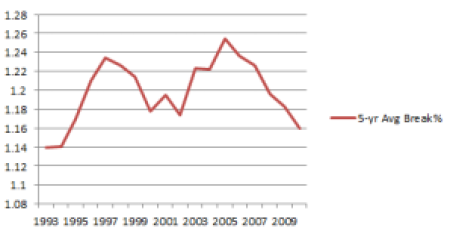
The larger the difference, the bigger the difference between hard and clay courts.  The most extreme five-year period in this span was 2003-07, when there were 25.4% more breaks on clay courts than on hard courts.  There has been a steady decline since then (to 16.9% for 2008-12), but not to as low a point as the early 90s (14.0% for 1991-1996), and only a bit lower than the turn of the century (17.8% for 1998-2002).  These numbers hardly identify the good old days when men were men and hard courts were hard.

When we turn to ace rate, the trend provides even less support for the surface-convergence theory.  Here are the same 5-year averages, representing the difference between hard-court ace rate and clay-court ace rate:

acediff2

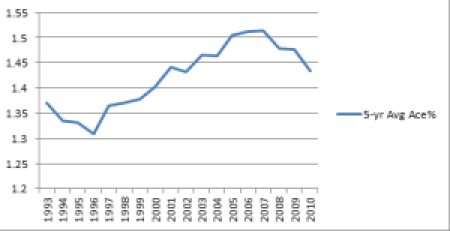
Here again, the most diverse results occurred during the 5-year span from 2003 to 2007, when hard-court aces were 51.3% higher than clay-court aces.  Since then, the difference has fallen to 46%, still a relatively large gap, one that only occurred in two single years before 2003.

If surfaces are converging, why is there a bigger difference in aces now than there was 10, 15, or 20 years ago? Why don’t we see hard-court break rates getting any closer to clay-court break rates?

However fast or high balls are bouncing off of today’s tennis surfaces, courts just aren’t playing any less diversely than they used to.  In the last 20 years, the game has changed in any number of ways, some of which can make hard-court matches look like clay-court contests and vice versa.  But with the profiles of clay and hard courts relatively unchanged over the last 20 years, it’s time for pundits to find something else to complain about.

How Fast is the Ice Rink in Sarajevo?

The Sarajevo challenger is considered to have one of the fastest surfaces on the tennis circuit.  James Cluskey, playing doubles there this week, tweeted, “fast is being very kind. Soo fast!”  Last year, some fans got the point across by calling the surface an ice rink.

The raw numbers agree.  In 13 of the 31 main-draw matches last year, aces made up at least 18% of all points.  Champion Jan Hernych won both his semfinal and final matches against players who scored aces on more than one in five service points.  Two years ago, titlist Amer Delic recorded a 21.6% ace rate for the entire tournament. That’s fast.

Here’s how fast.  The average player who competed in Sarajevo in any of the last three years hit 50% more aces in Sarajevo than his season average.  That’s higher than any other European challenger, a tick above Ortisei (+46%) and well ahead of the third-place fast court, the carpet in Eckental (+31%). (For more on methodology, click here.)

These numbers probably understate just how speedy the Sarajevo surface is.  The players who show up for events like this generally have a game to match–they may not all know about the “ice rink” reputation, but they know it’s indoors.  That’s how you end up with Dustin Brown, Ilija Bozoljac, and Hernych in the late rounds last year.  Jerzy Janowicz was there as well.

Thus, the guys who play in Sarajevo are generally choosing fast surfaces.  So Sarajevo isn’t 50% faster than tour average, it’s 50% faster than the faster-than-average event that these types of players choose.  This is a much bigger factor on the challenger tour than at ATP level, because lower-level guys don’t all play the same events.  Clay-court specialists may show up for Valencia and the Paris Masters, but you won’t find a single South American playing in Bosnia this week.

So we can’t compare Sarajevo to Sao Paulo or Medellin.  (Due to the altitude, those are fast as well, but probably not to the same degree.)  But by any reasonable comparison we can calculate, Sarajevo is as fast as it gets–at least until some savvy promoter puts a tennis match on a real ice rink.