Del Potro’s Draws and the Possible Persistence of Bad Luck

Italian translation at settesei.it

Tennis’s draw gods have not been kind to Juan Martin del Potro this year.

In Acapulco and Indian Wells, he drew Novak Djokovic as his second-match opponent. In Miami, Delpo got a third-rounder with Roger Federer. In each of the March Masters events, with 1,000 ranking points at stake, del Potro was handed the most difficult opponents for his first round against a fellow seed. Thanks in part to the resulting early exits, one of the most dangerous players on tour is still languishing outside of the top 30 in the ATP rankings.

When I wrote about the Indian Wells quarter of death–the section of the draw containing del Potro, Djokovic, Federer, Rafael Nadal, and Nick Kyrgios–I attempted to quantify the effect of the draw on each player’s expected ranking points. Before each player’s name was placed in the bracket, my model predicted that Delpo would earn about 150 ranking points–the weighted average of his likelihood of reaching the third round, the fourth round, and so on–and after the draw was conducted, his higher probability of a clash with Djokovic knocked that number down to just over 100. That negative effect was one of the worst of any player in the tournament.

The story in Miami is similar, if less extreme. Pre-draw, Delpo’s expected points were 183. Post draw: 155. In the four tournaments he has entered this year, he has been uniformly unlucky:

Tournament    Pre-Draw  Post-Draw  Effect  
Delray Beach      89.3       74.0  -17.1%  
Acapulco         121.5       97.1  -20.1%  
Indian Wells     154.6      102.5  -33.7%  
Miami            182.9      155.4  -15.0%  
TOTAL            548.2      429.0  -21.7%

*The numbers above for Indian Wells are slightly different than what I published in the Indian Wells article, since the simulations I ran for this post consider the entire 96-player field, not just the 64-player second round.

The good news, as we’ll see, is that it’s virtually impossible for this degree of misfortune to continue. The bad news is that those 119 points are gone forever, and at Delpo’s current position in the ranking table, that disadvantage will affect his tournament seeds, which in turn will result in worse draws (earlier meetings with higher-ranked players, independent of luck) for at least another few weeks.

Before we go any further, let me review the methodology I’m using here. (If you’re not interested, skip this paragraph.) For “post-draw” expected points, I’m taking jrank-based forecasts–like the ones on the front page of Tennis Abstract–and using each player’s probability of each round to calculate a weighted average of expected points. “Pre-draw” forecasts are much more computationally demanding. In Miami, for instance, Delpo could’ve faced any of the 64 unseeded players in the second round and been slated to meet any of the top eight seeds in the third round. For each tournament, I ran a Monte Carlo simulation with the tournament seeds, generating a new draw and simulating the tournament–100,000 times, then summing all those outcomes. So in the pre-draw forecast, Delpo had a one-eighth chance of getting Fed in the third round, a one-eighth chance of getting Kei Nishikori there, and so on.

It seems clear that a 22%, 119-point rankings hit over the course of four tournaments is some seriously bad luck. Last year, there were about 750 instances of a player being seeded at an ATP tournament, and in fewer than 60 of those, the draw resulted in an effect of -22% or worse on the player’s expected ranking points. And that’s just one tournament! The odds that Delpo would get such a rough deal in all four of his 2017 tournaments are 1 in more than 20,000.

Over the course of a full season, draw luck mostly evens out. It’s rare to see an effect of more than 10% in either direction. Last year, Thiemo de Bakker saw a painful difference of 18% between his pre-draw and post-draw expected points in 12 ATP events, but everyone else with at least that many tournaments fell between -11% and +11%, with three-quarters of players between -5% and +5%. Even when draw luck doesn’t balance itself out, the effect isn’t as bad as what Delpo has seen in 2017.

Del Potro’s own experience in 2016 is a case in point. His most memorable event of the season was the Olympics, where he drew Djokovic in the first round, so it’s easy to recall his year as being equally riddled with bad luck. But in his 12 other ATP events, the draw aided him in six–including a +34% boost at the US Open–and hurt him at the other six. Altogether, his 2016 ATP draws gave him a 5.9% advantage over his “pre-draw” expected points–a bonus of 17 ranking points. (I didn’t include the Olympics, since no ranking points were awarded there.)

Taken together, Delpo’s 2016-17 draws have deprived him of about 100 ranking points, which would move him three spots up the ranking table. So even with a short stretch of extreme misfortune, draw luck hasn’t affected him that much. Last year’s most extreme case among elite players, Richard Gasquet, suffered a similar effect: His draws knocked down his expected take by 9%, or 237 points, a difference that would bump him up from #22 to #19 in this week’s ranking list.

There are many reasons to believe that del Potro is a much better player than his current ranking suggests, such as his Elo rating, which stands at No. 7. But his ATP ranking reflects his limited schedule and modest start last year much more than it does the vagaries of each week’s brackets. The chances are near zero that he will continue to draw the toughest player in each tournament’s field in the earliest possible round, so we’ll soon have a better idea of what exactly he is capable of, and where exactly he should stand in the rankings.

Playing Even Better Than Number One

Italian translation at settesei.it

Last night in Miami, Venus Williams beat newly re-minted WTA No. 1 Angelique Kerber. Venus, of course, has plenty of experience clashing with the very best in women’s tennis, with 15 Grand Slam finals and three spells at the No. 1 ranking herself.

Last night’s quarterfinal was Venus’s 37th match against a WTA No. 1  and her 15th win. Kerber became the sixth different top-ranked player to lose at the hands of the elder Williams sister.

All of these numbers are very impressive, especially when you consider that, taken as a whole, WTA No. 1s have won just over 88% of their nearly 2,300 matches since the modern ranking system was instituted. However, Venus doesn’t hold the record in any of these categories.

Records against No. 1s are a somewhat odd classification, since the best players tend to reach the top spot themselves. For example, Martina Hingis played only 11 matches against top-ranked opponents, barely one-fifth as many as the leader in that category. On the other hand, injuries and other layoffs have meant that many all-time greats have found themselves lower in the rankings for long stretches. That is particularly true of Venus and Serena Williams.

With her 37 matches played against No. 1s, Venus is approaching the top of the list, but it will take a superhuman effort to catch Arantxa Sanchez Vicario, at 51:

Rank  Player                   Matches vs No. 1
1     Arantxa Sanchez Vicario                51
2     Gabriela Sabatini                      38
3     Venus Williams                         37
4     Lindsay Davenport                      34
5     Conchita Martinez                      33
6     Helena Sukova                          31
7     Serena Williams                        28
8     Svetlana Kuznetsova                    27
-     Jana Novotna                           27
10    Amelie Mauresmo                        25
11    Maria Sharapova                        23

Wins against No. 1s is a more achievable goal. Martina Navratilova holds the current record at 18*, followed by Serena at 16, and then Lindsay Davenport and Venus at 15:

Rank  Player               Wins  Losses
1     Martina Navratilova    18*      
2     Serena Williams        16      12
3     Lindsay Davenport      15      19
-     Venus Williams         15      22
5     Steffi Graf            11       8
6     Gabriela Sabatini      10      28
7     Amelie Mauresmo         8      17
8     Svetlana Kuznetsova     7      20
-     Maria Sharapova         7      16
-     Mary Pierce             7      15
-     Justine Henin           7       9

*My database does not have rankings throughout Navratilova’s entire career, but other sources credit her with 18 wins.

Win percentage against top-ranked opponents is a bit trickier, as it depends where you set the minimum number of matches. I’ve drawn the line at five. That’s rather low, but I wanted to include Alize Cornet and Elina Svitolina, active players who have each won three of their six matches against No. 1s. By this standard, Venus ranks eighth, though equally reasonable thresholds of 8 or 10 matches would move her up two or three places:

Rank  Player             Wins  Losses   Win%
1     Steffi Graf          11       8  57.9%
2     Serena Williams      16      12  57.1%
3     Petra Kvitova         5       4  55.6%
4     Elina Svitolina       3       3  50.0%
-     Alize Cornet          3       3  50.0%
6     Lindsay Davenport    15      19  44.1%
7     Justine Henin         7       9  43.8%
8     Venus Williams       15      22  40.5%
9     Vera Zvonareva        4       7  36.4%
-     Dinara Safina         4       7  36.4%

Remember that the average player wins fewer than 12% of matches against No. 1s!

Finally, Venus’s defeat of Kerber gave her a win against her sixth different No. 1, moving her into second place in that department. As is so often the case, she trails only her sister, who has beaten seven. Oddly enough, there is very little overlap between Serena’s and Venus’s lists: Their only common victims are Hingis and Davenport. The full list:

Rank  Player               No. 1s defeated
1     Serena Williams                    7
2     Venus Williams                     6
3     Steffi Graf                        5
-     Kim Clijsters                      5
-     Amelie Mauresmo                    5
-     Maria Sharapova                    5
7     Petra Kvitova                      4
-     Lindsay Davenport                  4
-     Justine Henin                      4
-     Svetlana Kuznetsova                4

If Karolina Pliskova–who now stands within 1500 points of No. 1 and could further close the gap in Miami–reaches the top spot, Venus may get a chance to beat a 7th top player. Of course, Serena could get that chance, as well.

Regulations for Returning Rule-Breakers

Italian translation at settesei.it

Next month, Maria Sharapova will complete her 15-month doping ban and return to the WTA tour in Stuttgart, where she has been granted a wild card. It’s no surprise that tournaments are eager to invite an extremely marketable former No. 1, and Sharapova has already lined up wild cards for the Premier-level events in Madrid and Rome.

This has generated no small amount of controversy. Many people see wild cards as a sort of reward or gift that is inappropriate for a player caught breaking such a serious rule. Many fans and fellow players think that, even after she has undergone a severe penalty, Sharapova doesn’t deserve this type of advantage.

Crucially, neither the ITF–which handles drug testing and issued the suspension–nor the WTA–which sets the guidelines for tournament entry–has anything to say about the situation. Each event must make its own decision. The French Open may refuse to invite Sharapova this year (and Wimbledon could follow suit) but any other tournament organizer who cares about selling tickets and sponsorships would want her in the draw.

In other words, with the possible exception of Paris and London, Sharapova will be able to pick up where she left off, entering whichever tournaments she wishes. The only disadvantage is that she won’t be seeded, meaning that we could see some draws that will make the Indian Wells quarter of death look like a friendly club tournament. If she plays well and stays healthy, she’ll probably earn her way to some seeds before the end of the season.

I’m not interested the argument about whether Sharapova “deserves” these wild cards. I’m not a fan of tournaments handing prize money and ranking points opportunities to favorites in any case, but on the other hand, Maria’s penalty was already severe. It doesn’t seem right that she would spend months scrambling for points in lower-level ITFs. When Viktor Troicki was suspended for one year in 2013, he was granted only two tour-level wild cards, so he needed six months to regain his former ranking.

My concern is for the Troickis of the tennis world. Both Sharapova’s and Troicki’s comebacks will ultimately be shaped by the decisions of individual tournaments, so Sharapova–an immensely marketable multiple-Slam winner–will get in almost everywhere she wants, while Troicki was forced to start almost from zero. Put another way: Sharapova’s 15-month ban will last 15 months (exactly 15 months, since she’ll play her first-round match in Stuttgart on the first possible day) while Troicki’s 12-month suspension knocked him out of contention for almost 18 months.

The WTA needs a set of rules that determine exactly what a player can expect upon return from a suspension. Fortunately, they already have something in place that can be adapted to serve the purpose: the “special ranking” for those with long-term injuries. (The ATP’s “protected ranking” rule is similar.) If a player is out of action for more than six months, she can use the ranking she held when she last competed to enter up to eight events, including up to two Premier Mandatories and two Grand Slams. Whether the player is iconic or anonymous, she has a fair chance to rebuild her ranking after recovering from injury.

This is my proposal: When a player returns from suspension, treat her like a player returning from injury, with one difference: For the first year back, no wild cards.  Sharapova would get into eight events–she might choose Stuttgart, Rome, Madrid, Roland Garros, Birmingham, Wimbledon, Toronto, and Cincinnati. If she played well in her first two months back, she would probably have a high enough ranking to get into the US Open without help, and the whole issue would cease to matter.

The details don’t need to be exactly the same as post-injury comebacks. I can imagine including two to four additional special ranking entries into ITFs or qualifying, in case a player wants to work her way back to tour level, as a sort of rehab assignment. The important thing here is that the rules would be the same for everyone. As harsh as Sharapova’s penalty is, it pales in comparison to the effect a 15-month ban could have on a less popular tour regular, as Troicki’s example demonstrates.

Like it or not, there will be more doping bans, and unless the tours institute this sort of standardized treatment, there will be more controversies about whether this player or that player deserves wild cards after they return to the tour. The ultimate severity of a penalty will always depend on many factors, but a player’s popularity should never be one of them.

The Indian Wells Quarter of Death

Italian translation at settesei.it

The Indian Wells men’s draw looks a bit lopsided this year. The bottom quarter, anchored by No. 2 seed Novak Djokovic, also features Roger Federer, Rafael Nadal, Juan Martin del Potro, and Nick Kyrgios. It doesn’t take much analysis to see that the bracket makes life more difficult for Djokovic, and by extension, it cleared the way for Andy Murray. Alas, Murray lost his opening match against Vasek Pospisil on Saturday, making No. 3 seed Stan Wawrinka the luckiest man in the desert.

The draw sets up some very noteworthy potential matches: Federer and Nadal haven’t played before the quarterfinal since their first encounter back in 2004, and Fed hasn’t played Djokovic before the semis in more than 40 meetings, since 2007. Kyrgios, who has now beaten all three of the elites in his quarter, is likely to get another chance to prove his mettle against the best.

I haven’t done a piece on draw luck for awhile, and this seemed like a great time to revisit the subject. The principle is straightforward: By taking the tournament field and generating random draws, we can do a sort of “retro-forecast” of what each player’s chances looked like before the draw was conducted–back when Djokovic’s road wouldn’t necessarily be so rocky. By comparing the retro-forecast to a projection based on the actual draw, we can see how much the luck of the draw impacted each player’s odds of piling up ranking points or winning the title.

Here are the eight players most heavily favored by the pre-draw forecast, along with the their chances of winning the title, both before and after the draw was conducted:

Player                 Pre-Draw  Post-Draw  
Novak Djokovic           26.08%     19.05%  
Andy Murray              19.30%     26.03%  
Roger Federer            10.24%      8.71%  
Rafael Nadal              5.46%      4.80%  
Stan Wawrinka             5.08%      7.14%  
Kei Nishikori             5.01%      5.67%  
Nick Kyrgios              4.05%      2.62%  
Juan Martin del Potro     4.00%      2.34%

These odds are based on my jrank rating system, which correlates closely with Elo. I use jrank here instead of Elo because it’s surface-specific. I’m also ignoring the first round of the main draw, which–since all 32 seeds get a first-round bye–is just a glorified qualifying round and has very little effect on the title chances of seeded players.

As you can see, the bottom quarter–the “group of death”–is in fact where title hopes go to die. Djokovic, who is still considered to be the best player in the game by both jrank and Elo, had a 26% pre-draw chance of defending his title, but it dropped to 19% once the names were placed in the bracket. Not coincidentally, Murray’s odds went in the opposite direction. Federer’s and Nadal’s title chances weren’t hit quite as hard, largely because they weren’t expected to get past Djokovic, no matter when they faced him.

The issue here isn’t just luck, it’s the limitation of the ATP ranking system. No one really thinks that del Potro entered the tournament as the 31st favorite, or that Kyrgios came in as the 15th. No set of rankings is perfect, but at the moment, the official rankings do a particularly poor job of reflecting the players with the best chances of winning hard court matches.  The less reliable the rankings, the better chance of a lopsided draw like the one in Indian Wells.

For a more in-depth look at the effect of the draw on players with lesser chances of winning the title, we need to look at “expected ranking points.” Using the odds that a player reaches each round, we can calculate his expected points for the entire event. For someone like Kyle Edmund, who would have almost no chance of winning the title regardless of the draw, expected points tells a more detailed story of the power of draw luck. Here are the ten players who were punished most severely by the bracket:

Player                 Pre-Draw Pts Post-Draw Pts  Effect  
Kyle Edmund                    28.8          14.3  -50.2%  
Steve Johnson                  65.7          36.5  -44.3%  
Vasek Pospisil                 29.1          19.4  -33.2%  
Juan Martin del Potro         154.0         104.2  -32.3%  
Stephane Robert                20.3          14.2  -30.1%  
Federico Delbonis              20.0          14.5  -27.9%  
Novak Djokovic                429.3         325.4  -24.2%  
Nick Kyrgios                  163.5         124.6  -23.8%  
Horacio Zeballos               17.6          14.1  -20.0%  
Alexander Zverev              113.6          91.5  -19.4%

At most tournaments, this list is dominated by players like Edmund and Pospisil: unseeded men with the misfortune of drawing an elite opponent in the first round. Much less common is to see so many seeds–particularly a top-two player–rating as the most unlucky. While Federer and Nadal don’t quite make the cut here, the numbers bear out our intuition: Fed’s draw knocked his expected points from 257 down to 227, and Nadal’s reduced his projected tally from 195 to 178.

The opposite list–those who enjoyed the best draw luck–features a lot of names from the top half, including both Murray and Wawrinka. Murray squandered his good fortune, putting Wawrinka in an even better position to take advantage of his own:

Player              Pre-Draw Pts  Post-Draw Pts  Effect  
Malek Jaziri                21.9           31.6   44.4%  
Damir Dzumhur               29.1           39.0   33.9%  
Martin Klizan               27.6           36.4   32.1%  
Joao Sousa                  24.7           31.1   25.9%  
Peter Gojowczyk             20.4           25.5   24.9%  
Tomas Berdych               93.6          116.6   24.6%  
Mischa Zverev               58.5           72.5   23.8%  
Yoshihito Nishioka          26.9           32.6   21.1%  
John Isner                  80.2           97.0   21.0%  
Andy Murray                369.1          444.2   20.3%  
Stan Wawrinka              197.8          237.7   20.1%

Over the course of the season, quirks like these tend to even out. Djokovic, on the other hand, must be wondering how he angered the draw gods: Just to earn a quarter-final place against Roger or Rafa, he’ll need to face Kyrgios and Delpo for the second consecutive tournament.

If Federer, Kyrgios, and del Potro can bring their ATP rankings closer in line with their true talent, they are less likely to find themselves in such dangerous draw sections. For Djokovic, that would be excellent news.

Are Taller Players the Future of Tennis?

This is a guest post by Wiley Schubert Reed.

This week, the Memphis Open features the three tallest players ever to play professional tennis: 6-foot-10″ John Isner, 6-foot-11″ Ivo Karlovic, and 6-foot-11″ Reilly Opelka. And while these three certainly stand out among all players in the sport, they are by no means the only giants in the game. Also in the Memphis draw: 6-foot-5″ Dustin Brown, 6-foot-6″ Sam Querrey, and 6-foot-8″ Kevin Anderson. (Brown withdrew due to injury, and with Opelka’s second-round loss yesterday, Isner and Karlovic are the only giants remaining in the field.)

https://www.instagram.com/p/BQjI1gJBKgE/

There is no denying that the players on the ATP and WTA tours are taller than the ones who were competing 25 years ago. The takeover by the tall has been obvious for some time in the men’s game, and it’s extended to near the very top of the women’s game as well. But despite alarms raised about the unbeatable giants among men, the merely tall men have held on to control of the game.

The main reason: The elegant symmetry at the game’s heart. The tallest players have an edge on serve, but that’s just half of tennis. And on the return, extreme height–at least for the men–turns out to be a big disadvantage. But a rising crop of tall men have shown promise beyond their service games. If one of the tallest young stars is going to challenge the likes of Novak Djokovic and Andy Murray, he’ll have to do it by trying to return serve like them, too.

Sorting out exactly how much height helps a player is a complicated thing. Just looking at the top 100 pros, for instance, makes the state of things look like a blowout win in favor of the tall. The median top-100 man is nearly an inch taller today than in 1990, and the average top-100 woman is 1.5 inches taller [1]. The number of extremely tall players in the top 100 has gone up, too:

                                    1990  Aug 2016  
Top 100 Men      Median Height  6-ft-0.0  6-ft-0.8  
               At least 6-ft-5        3%       16%  
Top 100 Women    Median Height  5-ft-6.9  5-ft-8.5  
                 At least 6-ft        8%        9%

Height is clearly a competitive advantage, as taller young players rise faster through the rankings than their shorter peers. Among the top 100 juniors each year from 2000 to 2009 [2], the tallest players (6-foot-5 and over for men and 6-foot and over for women) [3] typically sit in the middle of the rankings. But they do better as pros: They were ranked on average approximately 127 spots higher than shorter players their age after four years for men and approximately 113 spots higher after four years for women.

Boys' pro ranking by height Girls' pro ranking by height


Thus, juniors who are very tall have the best chance to build a solid pro career. But does that advantage hold within the top 100 of the pro rankings? Are the tallest pros the highest ranked? 

For the women, they clearly are. From 1985 to 2016, the median top 10 woman was 1.2 inches taller than the median player ranked between No. 11 and No. 100, and the tallest women are winning an outsize portion of titles, with women 6-foot and taller winning 15.0 percent of Grand Slams, while making up only 6.6 percent of the top 100 over the same period. Most of these wins were by Lindsay Davenport, Venus Williams and Maria Sharapova. Garbiñe Muguruza became the latest 6-foot women’s champ at the French Open last year [4]. 

It’s a different story for the men, however. From 1985 to 2016, the median height of both the top 10 men and men ranked No. 11 to No. 100 was the same: 6-foot-0.8. And in those same 32 years, only three Grand Slam titles (2.4 percent) were won by players 6-foot-5 or taller (one each by Richard Krajicek, Juan Martin del Potro and Marin Cilic), while over the same period, players 6-foot-5 and above made up 7.7 percent of the top 100. In short, the tallest women are overperforming, while the tallest men are underperforming.

Why have all the big men accomplished so little collectively? One big reason is that whatever edge the tallest men gain in serving is cancelled out by their disadvantage when returning serve. I compared total points played by top-100 pros since 2011, and found that while players 6-foot-5 and over have a clear service advantage and return disadvantage, their height doesn’t seem to have a major impact on overall points won:

Height            % Svc Pts Won  % Ret Pts Won  % Tot Pts Won  
6-ft-5 and above          66.8%          35.7%          51.2%  
6-ft-1 to 6-ft-4          64.5%          37.8%          51.1%  
6-ft-0 and below          62.3%          39.1%          51.1%

Taller players serve better for two reasons. First, their height lets them serve at a sharper angle by changing the geometry of the court. With a sharper angle available to them, they have a greater margin for error to clear the top of the net while still getting the ball to bounce on or inside the service line. And a sharper angle also makes the ball bounce higher, up and out of returners’ strike zone [5].

Serve trajectory

Disregarding spin, for a 6-foot player to serve the ball at 120 miles per hour at the same angle as a 6-foot-5 player, he would need to stand more than 3 feet inside the baseline.

Second, a taller player’s longer serving arm allows him to whip the ball faster. For you physics fans, the torque (in this case magnitude of force imparted on the ball) is directly proportional to the radius of the lever arm (in this case the server’s extended arm and racket). As radius (arm length) increases, so does torque. There is no way for shorter players to make up this advantage. Six-foot-8 Kevin Anderson, current No. 74 in the world and one of the tallest players ever to make the top 10, told me, “I always say it’ll be easier for me to move like Djokovic than it will be for Djokovic to serve like me.”

One would think that height could be an advantage on return as well, with increased wingspan offering greater reach. 18-year-old, 6-foot-11 Reilly Opelka, who is already as tall as the tour’s reigning giant Ivo Karlovic and who ESPN commentator Brad Gilbert said will be “for sure the biggest ever,” told me his height gives him longer leverage. “My reach is a lot longer than a normal tennis player, so I’m able to cover a couple extra inches, which is pretty huge in tennis.”

But Gilbert and Tennis Channel commentator Justin Gimelstob said they believe tall players struggle on return because their higher center of gravity hurts their movement. If a very tall man can learn to move like the merely tall players that have long dominated the sport––Djokovic, Murray (6-foot-3), Roger Federer (6-foot-1) and Rafael Nadal (6-foot-1)–– Gilbert thinks he could be hard to stop. “If you’re 6-foot-6 and are able to move like that, I can easily see that size dominating,” he said.

Interestingly, Gilbert pointed out that some of the best returners in the women’s game––such as Victoria Azarenka (6-foot-0) and Maria Sharapova (6-foot-2)––are among its tallest players [6]. Carl Bialik asked three American women — 5-foot-11 Julia Boserup, 5-foot-10 Jennifer Brady and 5-foot-4 Sachia Vickery — why they think taller women aren’t at a disadvantage on return. They cited two main reasons: 1) Women are returning women’s serves, which are slower and have less spin, on average, than men’s serves, so they have more time to make up for any difficulty in movement; and 2) Women play on the same size court that men do, but a height that’s relatively tall for a woman is about average for men, and it’s a height that works well for returning, no matter your gender.

“On the women’s side, we don’t really have anyone who’s almost 6-foot-11 or 7-foot tall,” Brady said. While she’s above average height on the women’s tour, “I’m not as tall as Reilly Opelka,” she said.

Another reason players as tall as Opelka tend to struggle on return could be that they focus more in practice on improving their service game, which exacerbates the serve-oriented skew of their games. “Being tall helps with the serve and you maybe tend to focus on your serve games even more,” Karlovic, the tallest top 100 player at 6-foot-11 [7], said in an interview conducted on my behalf by members of the ATP World Tour PR & Marketing staff at the Bucharest tournament in April. “Shorter players aren’t as strong at serve so they work their return more.”

Charting the careers of all active male players 6-foot-5 and above who at some point ranked year-end top 100 bears this out. Their percentage of service points won increased by about 6 percentage points over their first eight years on tour [8], while percentage of return points won only increased by about 1.5 percentage points. In contrast, Novak Djokovic has steadily improved his return points won from 36.7 percent in 2005 to 43.9 percent in 2016.

When very tall men break through, it’s usually because of strong performance on return: del Potro and Cilic, who are both 6-foot-6, boosted their return performances to win the US Open in 2009 and 2014, respectively. At the 2009 US Open, del Potro won 44 percent of return points, up from his 40 percent rate on the whole year, including the Open. At the 2014 US Open, Cilic won 41 percent of return points, up from 38 percent that year. And they didn’t improve their return games by facing easy slates of opponents: Each man improved on his return-point winning rates against those same opponents over his career by about the same amount as he elevated his return game compared to the season as a whole.

“It’s a different type of pressure when you’re playing a big server who is putting pressure on you on both the serve and the return,” Gimelstob said. “That’s what Cilic was doing when he won the US Open. That’s the challenge of playing del Potro because he hits the ball so well, but obviously serves so well, also.” To put things into perspective, if del Potro and Cilic had returned at these levels across 2016, each would have ranked among the top seven returners in the game, joining Djokovic, Nadal, Murray, 5-foot-11 David Goffin, and 5-foot-9 David Ferrer. Neither man, though, has been able to return to a Slam final; del Potro has struggled with injury and Cilic with inconsistency.

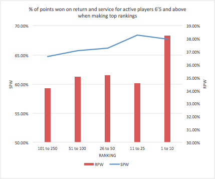
For the tallest players, return performance is the difference between making the top 50 and the top 10. On average, active players 6-foot-5 and above who finished a year ranked in the top 10 won 67.7 percent of service points that year, while those who finished a year ranked 11 through 50 won 68.1 percent of service points, on average. That’s a difference of only 0.4 percentage points. The difference in return performance between merely making the top 50 and reaching the top 10, however, is far more striking: Tall players who made the top 10 win return points at a rate nearly 4 percentage points higher than do players ranked 11 through 50.

Tall players' points won

A solid-serving player 6-foot-5 or taller who can consistently win more than 38 percent of points on return has an excellent chance of making the top 10. Tomas Berdych and del Potro have done it, and Milos Raonic is approaching that mark, one reason he reached his first major final this year at Wimbledon. Today there are several tall young men who look like they could eventually win 38 percent of return points or better. Alexander Zverev (ranked 18) and Karen Khachanov (ranked 48) are both 6-foot-6, each won about 38 percent of return points in 2016, and neither is older than 20. Khachanov has impressed Gilbert and Karlovic. “That guy moves tremendous for 6-foot-6,” Gilbert said.

Other giants have impressed recently. Jiri Vesely, who is 23 and 6-foot-6, beat Novak Djokovic last year in Monte Carlo and won nearly 36 percent of return points in 2016. Opelka reached his first tour-level semifinal, in Atlanta. Most of the top 10 seeds at Wimbledon lost to players 6-foot-5 or taller. Del Potro won Olympic silver, beating Djokovic and Nadal along the way.

But moving from the top 10 to the top 1 or 2 is another question. Can a taller tennis player develop the skills to move as well as the top shorter players, and win multiple major titles? Well, it’s happened in basketball. “We haven’t had a big guy play tennis that’s like 6-foot-6, 6-foot-7, 6-foot-8, that’s moved like an NBA guy,” Gilbert said. “When you get that, that’s when you get a multiple Slam winner.” Anderson agrees that height is not the obstacle to movement people play it up to be: “You know, LeBron is 6-foot-8. If he can move as well as somebody who’s 5-foot-10, his size now is a huge advantage; there’s not a negative to it.”

Opelka, who qualified for his first grand slam main draw at the 2017 Australian Open where he pushed 11th-ranked David Goffin to five sets, says he is specifically focusing on the return part of his game in practice. “I’ve been spending a ton of time working on my return. When you look at the drills I’m doing in the gym, they work on explosive movement.” But he also points out that basketball players “move better than [tennis players] and are more explosive than [tennis players]” because of their incredible muscle mass, which won’t work for tennis. “I don’t know how they’d be able to keep up for four or five hours with that mass and muscle.” Put LeBron on Arthur Ashe Stadium at the U.S. Open in 100 degree heat for an afternoon, “it’s tough to say how they’ll compare.”

Zverev, who is 19 and 6-foot-6, agrees that tall tennis players face unique challenges: “Movement is much more difficult, and I think building your body is more difficult as well.” But the people I talked to believe that both Opelka and Zverev could be at the top of the game in a few years’ time. “Zverev––that guy could be No. 1 in the world,” Gilbert said. “He serves great, he returns great and he moves great.” And as for Opelka, Gilbert says: “Right now he’s got a monster serve. If he can develop movement, or a return game, who knows where he could go?”

Whether the tallest guys can develop the skills to consistently return at the level of a Djokovic or a Murray remains to be seen. But starting out with a huge serve is a major step toward eventually challenging them. As Opelka says, “every inch is important.”


Wiley Schubert Reed is a junior tennis player and fan who has written about tennis for fivethirtyeight.com. He is a senior at the United Nations International School in New York and will be entering Harvard University in the fall.


Continue reading Are Taller Players the Future of Tennis?

The Federer Backhand That Finally Beat Nadal

Italian translation at settesei.it

Roger Federer and Rafael Nadal first met on court in 2004, and they contested their first Grand Slam final two years later. The head-to-head has long skewed in Rafa’s favor: Entering yesterday’s match, Nadal led 23-11, including 9-2 in majors. Nadal’s defense has usually trumped Roger’s offense, but after a five-set battle in yesterday’s Australian Open final, it was Federer who came out on top. Rafa’s signature topspin was less explosive than usual, and Federer’s extremely aggressive tactics took advantage of the fast conditions to generate one opportunity after another in the deciding fifth set.

In the past, Nadal’s topspin has been particularly damaging to Federer’s one-handed backhand, one of the most beautiful shots in the sport–but not the most effective. The last time the two players met in Melbourne, in a 2014 semifinal the Spaniard won in straight sets, Nadal hit 89 crosscourt forehands, shots that challenges Federer’s backhand, nearly three-quarters of them (66) in points he won. Yesterday, he hit 122 crosscourt forehands, less than half of them in points he won. Rafa’s tactics were similar, but instead of advancing easily, he came out on the losing side.

Federer’s backhand was unusually effective yesterday, especially compared to his other matches against Nadal. It wasn’t the only thing he did well, but as we’ll see, it accounted for more than the difference between the two players.

A metric I’ve devised called Backhand Potency (BHP) illustrates just how much better Fed executed with his one-hander. BHP approximates the number of points whose outcomes were affected by the backhand: add one point for a winner or an opponent’s forced error, subtract one for an unforced error, add a half-point for a backhand that set up a winner or opponent’s error on the following shot, and subtract a half-point for a backhand that set up a winning shot from the opponent. Divide by the total number of backhands, multiply by 100*, and the result is net effect of each player’s backhand. Using shot-by-shot data from over 1,400 men’s matches logged by the Match Charting Project, we can calculate BHP for dozens of active players and many former stars.

* The average men’s match consists of approximately 125 backhands (excluding slices), while Federer and Nadal each hit over 200 in yesterday’s five-setter.

By the BHP metric, Federer’s backhand is neutral: +0.2 points per 100 backhands. Fed wins most points with his serve and his forehand; a neutral BHP indicates that while his backhand isn’t doing the damage, at least it isn’t working against him. Nadal’s BHP is +1.7 per 100 backhands, a few ticks below those of Murray and Djokovic, whose BHPs are +2.6 and +2.5, respectively. Among the game’s current elite, Kei Nishikori sports the best BHP, at +3.6, while Andre Agassi‘s was a whopping +5.0. At the other extreme, Marin Cilic‘s is -2.9, Milos Raonic‘s is -3.7, and Jack Sock‘s is -6.6. Fortunately, you don’t have to hit very many backhands to shine in doubles.

BHP tells us just how much Federer’s backhand excelled yesterday: It rose to +7.8 per 100 shots, a better mark than Fed has ever posted against his rival. Here are his BHPs for every Slam meeting:

Match       RF BHP  
2006 RG      -11.2  
2006 WIMB*    -3.4  
2007 RG       -0.7  
2007 WIMB*    -1.0  
2008 RG      -10.1  
2008 WIMB     -0.8  
2009 AO        0.0  
2011 RG       -3.7  
2012 AO       -0.2  
2014 AO       -9.9  
2017 AO*      +7.8 

* matches won by Federer

Yesterday’s rate of +7.8 per 100 shots equates to an advantage of +17 over the course of his 219 backhands. One unit of BHP is equivalent to about two-thirds of a point of match play, since BHP can award up to a combined 1.5 points for the two shots that set up and then finish a point. Thus, a +17 BHP accounts for about 11 points, exactly the difference between Federer and Nadal yesterday. Such a performance differs greatly from what Nadal has done to Fed’s backhand in the past: On average, Rafa has knocked his BHP down to -1.9, a bit more than Nadal’s effect on his typical opponent, which is a -1.7 point drop. In the 25 Federer-Nadal matches for which the Match Charting Project has data, Federer has only posted a positive BHP five times, and before yesterday’s match, none of those achievements came at a major.

The career-long trend suggests that, next time Federer and Nadal meet, the topspin-versus-backhand matchup will return to normal. The only previous time Federer recorded a +5 BHP or better against Nadal, at the 2007 Tour Finals, he followed it up by falling to -10.1 in their next match, at the 2008 French Open. He didn’t post another positive BHP until 2010, six matches later.

Outlier or not, Federer’s backhand performance yesterday changed history.  Using the approximation provided by BHP, had Federer brought his neutral backhand, Nadal would have won 52% of the 289 points played—exactly his career average against the Swiss—instead of the 48% he actually won. The long-standing rivalry has required both players to improve their games for more than a decade, and at least for one day, Federer finally plugged the gap against the opponent who has frustrated him the most.

Benchmarks for Shot-by-Shot Analysis

Italian translation at settesei.it

In my post last week, I outlined what the error stats of the future may look like. A wide range of advanced stats across different sports, from baseball to ice hockey–and increasingly in tennis–follow the same general algorithm:

  1. Classify events (shots, opportunities, whatever) into categories;
  2. Establish expected levels of performance–often league-average–for each category;
  3. Compare players (or specific games or tournaments) to those expected levels.

The first step is, by far, the most complex. Classification depends in large part on available data. In baseball, for example, the earliest fielding metrics of this type had little more to work with than the number of balls in play. Now, batted balls can be categorized by exact location, launch angle, speed off the bat, and more. Having more data doesn’t necessarily make the task any simpler, as there are so many potential classification methods one could use.

The same will be true in tennis, eventually, when Hawkeye data (or something similar) is publicly available. For now, those of us relying on public datasets still have plenty to work with, particularly the 1.6 million shots logged as part of the Match Charting Project.*

*The Match Charting Project is a crowd-sourced effort to track professional matches. Please help us improve tennis analytics by contributing to this one-of-a-kind dataset. Click here to find out how to get started.

The shot-coding method I adopted for the Match Charting Project makes step one of the algorithm relatively straightforward. MCP data classifies shots in two primary ways: type (forehand, backhand, backhand slice, forehand volley, etc.) and direction (down the middle, or to the right or left corner). While this approach omits many details (depth, speed, spin, etc.), it’s about as much data as we can expect a human coder to track in real-time.

For example, we could use the MCP data to find the ATP tour-average rate of unforced errors when a player tries to hit a cross-court forehand, then compare everyone on tour to that benchmark. Tour average is 10%, Novak Djokovic‘s unforced error rate is 7%, and John Isner‘s is 17%. Of course, that isn’t the whole picture when comparing the effectiveness of cross-court forehands: While the average ATPer hits 7% of his cross-court forehands for winners, Djokovic’s rate is only 6% compared to Isner’s 16%.

However, it’s necessary to take a wider perspective. Instead of shots, I believe it will be more valuable to investigate shot opportunities. That is, instead of asking what happens when a player is in position to hit a specific shot, we should be figuring out what happens when the player is presented with a chance to hit a shot in a certain part of the court.

This is particularly important if we want to get beyond the misleading distinction between forced and unforced errors. (As well as the line between errors and an opponent’s winners, which lie on the same continuum–winners are simply shots that were too good to allow a player to make a forced error.) In the Isner/Djokovic example above, our denominator was “forehands in a certain part of the court that the player had a reasonable chance of putting back in play”–that is, successful forehands plus forehand unforced errors. We aren’t comparing apples to apples here: Given the exact same opportunities, Djokovic is going to reach more balls, perhaps making unforced errors where we would call Isner’s mistakes forced errors.

Outcomes of opportunities

Let me clarify exactly what I mean by shot opportunities. They are defined by what a player’s opponent does, regardless of how the player himself manages to respond–or if he manages to get a racket on the ball at all. For instance, assuming a matchup between right-handers, here is a cross-court forehand:

illustration of a shot opportunity

Player A, at the top of the diagram, is hitting the shot, presenting player B with a shot opportunity. Here is one way of classifying the outcomes that could ensue, together with the abbreviations I’ll use for each in the charts below:

  • player B fails to reach the ball, resulting in a winner for player A (vs W)
  • player B reaches the ball, but commits a forced error (FE)
  • player B commits an unforced error (UFE)
  • player B puts the ball back in play, but goes on to lose the point (ip-L)
  • player B puts the ball back in play, presents player A with a “makeable” shot, and goes on to win the point (ip-W)
  • player B causes player A to commit a forced error (ind FE)
  • player B hits a winner (W)

As always, for any given denominator, we could devise different categories, perhaps combining forced and unforced errors into one, or further classifying the “in play” categories to identify whether the player is setting himself up to quickly end the point. We might also look at different categories altogether, like shot selection.

In any case, the categories above give us a good general idea of how players respond to different opportunities, and how those opportunities differ from each other. The following chart shows–to adopt the language of the example above–player B’s outcomes based on player A’s shots, categorized only by shot type:

Outcomes of opportunities by shot type

The outcomes are stacked from worst to best. At the bottom is the percentage of opponent winners (vs W)–opportunities where the player we’re interested in didn’t even make contact with the ball. At the top is the percentage of winners (W) that our player hit in response to the opportunity. As we’d expect, forehands present the most difficult opportunities: 5.7% of them go for winners and another 4.6% result in forced errors. Players are able to convert those opportunities into points won only 42.3% of the time, compared to 46.3% when facing a backhand, 52.5% when facing a backhand slice (or chip), and 56.3% when facing a forehand slice.

The above chart is based on about 374,000 shots: All the baseline opportunities that arose (that is, excluding serves, which need to be treated separately) in over 1,000 logged matches between two righties. Of course, there are plenty of important variables to further distinguish those shots, beyond simply categorizing by shot type. Here are the outcomes of shot opportunities at various stages of the rally when the player’s opponent hits a forehand:

Outcomes of forehand responses based on number of shots

The leftmost column can be seen as the results of “opportunities to hit a third shot”–that is, outcomes when the serve return is a forehand. Once again, the numbers are in line with what we would expect: The best time to hit a winner off a forehand is on the third shot–the “serve-plus-one” tactic. We can see that in another way in the next column, representing opportunities to hit a fourth shot. If your opponent hits a forehand in play for his serve-plus-one shot, there’s a 10% chance you won’t even be able to get a racket on it. The average player’s chances of winning the point from that position are only 38.4%.

Beyond the 3rd and 4th shot, I’ve divided opportunities into those faced by the server (5th shot, 7th shot, and so on) and those faced by the returner (6th, 8th, etc.). As you can see, by the 5th shot, there isn’t much of a difference, at least not when facing a forehand.

Let’s look at one more chart: Outcomes of opportunities when the opponent hits a forehand in various directions. (Again, we’re only looking at righty-righty matchups.)

Outcomes of forehand responses based on shot direction

There’s very little difference between the two corners, and it’s clear that it’s more difficult to make good of a shot opportunity in either corner than it is from the middle. It’s interesting to note here that, when faced with a forehand that lands in play–regardless of where it is aimed–the average player has less than a 50% chance of winning the point. This is a confusing instance of selection bias that crops up occasionally in tennis analytics: Because a significant percentage of shots are errors, the player who just placed a shot in the court has a temporary advantage.

Next steps

If you’re wondering what the point of all of this is, I understand. (And I appreciate you getting this far despite your reservations.) Until we drill down to much more specific situations–and maybe even then–these tour averages are no more than curiosities. It doesn’t exactly turn the analytics world upside down to show that forehands are more effective than backhand slices, or that hitting to the corners is more effective than hitting down the middle.

These averages are ultimately only tools to better quantify the accomplishments of specific players. As I continue to explore this type of algorithm, combined with the growing Match Charting Project dataset, we’ll learn a lot more about the characteristics of the world’s best players, and what makes some so much more effective than others.

Measuring the Performance of Tennis Prediction Models

With the recent buzz about Elo rankings in tennis, both at FiveThirtyEight and here at Tennis Abstract, comes the ability to forecast the results of tennis matches. It’s not far fetched to ask yourself, which of these different models perform better and, even more interesting, how they fare compared to other ‘models’, such as the ATP ranking system or betting markets.

For this, admittedly limited, investigation, we collected the (implied) forecasts of five models, that is, FiveThirtyEight, Tennis Abstract, Riles, the official ATP rankings, and the Pinnacle betting market for the US Open 2016. The first three models are based on Elo. For inferring forecasts from the ATP ranking, we use a specific formula1 and for Pinnacle, which is one of the biggest tennis bookmakers, we calculate the implied probabilities based on the provided odds (minus the overround)2.

Next, we simply compare forecasts with reality for each model asking If player A was predicted to be the winner (P(a) > 0.5), did he really win the match? When we do that for each match and each model (ignoring retirements or walkovers) we come up with the following results.

Model		% correct
Pinnacle	76.92%
538		75.21%
TA		74.36%
ATP		72.65%
Riles		70.09%

What we see here is how many percent of the predictions were actually right. The betting model (based on the odds of Pinnacle) comes out on top followed by the Elo models of FiveThirtyEight and Tennis Abstract. Interestingly, the Elo model of Riles is outperformed by the predictions inferred from the ATP ranking. Since there are several parameters that can be used to tweak an Elo model, Riles may still have some room left for improvement.

However, just looking at the percentage of correctly called matches does not tell the whole story. In fact, there are more granular metrics to investigate the performance of a prediction model: Calibration, for instance, captures the ability of a model to provide forecast probabilities that are close to the true probabilities. In other words, in an ideal model, we want 70% forecasts to be true exactly in 70% of the cases. Resolution measures how much the forecasts differ from the overall average. The rationale here is, that just using the expected average values for forecasting will lead to a reasonably well-calibrated set of predictions, however, it will not be as useful as a method that manages the same calibration while taking current circumstances into account. In other words, the more extreme (and still correct) forecasts are, the better.

In the following table we categorize the set of predictions into bins of different probabilities and show how many percent of the predictions were correct per bin. This also enables us to calculate Calibration and Resolution measures for each model.

Model    50-59%  60-69%  70-79%  80-89%  90-100% Cal  Res   Brier
538      53%     61%     85%     80%     91%     .003 .082  .171
TA       56%     75%     78%     74%     90%     .003 .072  .182
Riles    56%     86%     81%     63%     67%     .017 .056  .211
ATP      50%     73%     77%     84%     100%    .003 .068  .185
Pinnacle 52%     91%     71%     77%     95%     .015 .093  .172

As we can see, the predictions are not always perfectly in line with what the corresponding bin would suggest. Some of these deviations, for instance the fact that for the Riles model only 67% of the 90-100% forecasts were correct, can be explained by small sample size (only three in that case). However, there are still two interesting cases (marked in bold) where sample size is better and which raised my interest. Both the Riles and Pinnacle models seem to be strongly underconfident (statistically significant) with their 60-69% predictions. In other words, these probabilities should have been higher, because, in reality, these forecasts were actually true 86% and 91% percent of the times.3 For the betting aficionados, the fact that Pinnacle underestimates the favorites here may be really interesting, because it could reveal some value as punters would say. For the Riles model, this would maybe be a starting point to tweak the model.

In the last three columns Calibration (the lower the better), Resolution (the higher the better), and the Brier score (the lower the better) are shown. The Brier score combines Calibration and Resolution (and the uncertainty of the outcomes) into a single score for measuring the accuracy of predictions. The models of FiveThirtyEight and Pinnacle (for the used subset of data) essentially perform equally good. Then there is a slight gap until the model of Tennis Abstract and the ATP ranking model come in third and fourth, respectively. The Riles model performs worst in terms of both Calibration and Resolution, hence, ranking fifth in this analysis.

To conclude, I would like to show a common visual representation that is used to graphically display a set of predictions. The reliability diagram compares the observed rate of forecasts with the forecast probability (similar to the above table).

The closer one of the colored lines is to the black line, the more reliable the forecasts are. If the forecast lines are above the black line, it means that forecasts are underconfident, in the opposite case, forecasts are overconfident. Given that we only investigated one tournament and therefore had to work with a low sample size (117 predictions), the big swings in the graph are somewhat expected. Still, we can see that the model based on ATP rankings does a really good job in preventing overestimations even though it is known to be outperformed by Elo in terms of prediction accuracy.

To sum up, this analysis shows how different predictive models for tennis can be compared among each other in a meaningful way. Moreover, I hope I could exhibit some of the areas where a model is good and where it’s bad. Obviously, this investigation could go into much more detail by, for example, comparing the models in how well they do for different kinds of players (e.g., based on ranking), different surfaces, etc. This is something I will spare for later. For now, I’ll try to get my sleeping patterns accustomed to the schedule of play for the Australian Open, and I hope, you can do the same.

Peter Wetz is a computer scientist interested in racket sports and data analytics based in Vienna, Austria.

Footnotes

1. P(a) = a^e / (a^e + b^e) where a are player A’s ranking points, b are player B’s ranking points, and e is a constant. We use e = 0.85 for ATP men’s singles.

2. The betting market in itself is not really a model, that is, the goal of the bookmakers is simply to balance their book. This means that the odds, more or less, reflect the wisdom of the crowd, making it a very good predictor.

3. As an example, one instance, where Pinnacle was underconfident and all other models were more confident is the R32 encounter between Ivo Karlovic and Jared Donaldson. Pinnacle’s implied probability for Karlovic to win was 64%. The other models (except the also underconfident Riles model) gave 72% (ATP ranking), 75% (FiveThirtyEight), and 82% (Tennis Abstract). Turns out, Karlovic won in straight sets. One factor at play here might be that these were the US Open where more US citizens are likely to be confident about the US player Jared Donaldson and hence place a bet on him. As a consequence, to balance the book, Pinnacle will lower the odds on Donaldson, which results in higher odds (and a lower implied probability) for Karlovic.

The Continuum of Errors

Italian translation at settesei.it

When is an error unforced? If you envision designing an algorithm to answer that question, it quickly becomes unmanageable. You’d need to take into account player position, shot velocity, angle, and spin, surface speed, and perhaps more. Many errors are obviously forced or unforced, but plenty fall into an ambiguous middle ground.

Most of the unforced error counts we see these days–via broadcasts or in post-match recaps–are counted by hand. A scorer is given some guidance, and he or she tallies each kind of error. If the human-scoring algorithm is boiled down to a single rule, it’s something like: “Would a typical pro be expected to make that shot?” Some scorers limit the number of unforced errors by always counting serve returns, or net shots, or attempted passing shots, as forced.

Of course, any attempt to sort missed shots into only two buckets is a gross oversimplification. I don’t think this is a radical viewpoint. Many tennis commentators acknowledge this when they explain that a player’s unforced error count “doesn’t tell the whole story,” or something to that effect. In the past, I’ve written about the limitations of the frequently-cited winner-to-unforced error ratio, and the similarity between unforced errors and the rightly-maligned fielding errors stat in baseball.

Imagine for a moment that we have better data to work with–say, Hawkeye data that isn’t locked in silos–and we can sketch out an improved way of looking at errors.

First, instead of classifying only errors, it’s more instructive to sort potential shots into three categories: shots returned in play, errors (which we can further distinguish later on), and opponent winners. In other words: Did you make it, did you miss it, or did you fail to even get a racket on it? One man’s forced error is another man’s ball put back in play*, so we need to consider the full range of possible outcomes from each potential shot.

*especially if the first man is Bernard Tomic and the other man is Andy Murray.

The key to gaining insight from tennis statistics is increasing the amount of context available–for instance, taking a player’s stats from today and comparing them to the typical performance of a tour player, or contrasting them with how he or she played in the last similar matchup. Errors are no different.

Here’s a basic example. In the sixth game of Angelique Kerber‘s match in Sydney this week against Darya Kasatkina, she hit a down-the-line forehand:

Kerber hits a down-the-line forehand

Thanks to the Match Charting Project, we have data for about 350 of Kerber’s down-the-line forehands, so we know it goes for a winner 25% of the time, and her opponent hits a forced error another 9% of the time. Say that a further 11% turn into unforced errors, and we have a profile for what usually happens when Kerber goes down the line: 25% winners, 20% errors, 55% put back in play. We might dig even deeper and establish that the 55% put back in play consists of 30% that ultimately resulted in Kerber winning the point against 25% that she eventually lost.

In this case, Kasatkina was able to get a racket on the ball, but missed the shot, resulting in what most scorers would agree was a forced error:

Kasatkina lunges for the return

This single instance–Kasatkina hitting a forced error against a very effective type of offensive shot–doesn’t tell us anything on its own. Imagine, though, that we tracked several players in 100 attempts each to reply to a Kerber down-the-line forehand. We might discover that Kasatkina lets 35 of 100 go for winners, or that Simona Halep lets only 15 go for winners and gets 70 back in play, or that Anastasia Pavlyuchenkova hits an error on 30 of the 100 attempts.

My point is this: With more granular data, we can put errors in a real-life context. Instead of making a judgment about the difficulty of a certain shot (or relying on a scorer to do so), it’s feasible to let an algorithm do the work on 100 shots, telling us whether a player is getting to more balls than the average player, or making more errors than she usually does.

The continuum, and the future

In the example outlined above, there’s a lot of important details that I didn’t mention. In comparing Kasatkina’s error to a few hundred other down-the-line Kerber forehands, we don’t know whether the shot was harder than usual, whether it was placed more accurately in the corner, whether Kasatkina was in better position than Kerber’s typical opponent on that type of shot, or the speed of the surface. Over the course of 100 down-the-line forehands, those factors would probably even out. But in Tuesday’s match, Kerber hit only 18 of them. While a typical best-of-three match will give us a few hundred shots to work with, this level of analysis can only tell us so much about specific shots.

The ideal error-classifying algorithm of the future would do much better. It would take all of the variables I’ve mentioned (and more, undoubtedly) and, for any shot, calculate the likelihood of different outcomes. At the moment of the first image above, when the ball has just come off of Kerber’s racket, with Kasatkina on the wrong half of the baseline, we might estimate that there is a 35% chance of a winner, a 25% chance of an error, and a 40% chance that ball is returned in play. Depending on the type of analysis we’re doing, we could calculate those numbers for the average WTA player, or for Kasatkina herself.

Those estimates would allow us, in effect, to “rate” errors. In this example, the algorithm gives Kasatkina only a 40% chance of getting the ball back in play. By contrast, an average rallying shot probably has a 90% chance of ending up back in play. Instead of placing errors in buckets of “forced” and “unforced,” we could draw lines wherever we wish, perhaps separating potential shots into quintiles. We would be able to quantify whether, for instance, Andy Murray gets more of the most unreturnable shots back in play than Novak Djokovic does. Even if we have an intuition about that already, we can’t even begin to prove it until we’ve established precisely what that “unreturnable” quintile (or quartile, or whatever) consists of.

This sort of analysis would be engaging even for those fans who never look at aggregate stats. Imagine if a broadcaster could point to a specific shot and say that Murray had only a 2% chance of putting it back in play. In topsy-turvy rallies, this approach could generate a win probability graph for a single point, an image that could encapsulate just how hard a player worked to come back from the brink.

Fortunately, the technology to accomplish this is already here. Researchers with access to subsets of Hawkeye data have begun drilling down to the factors that influence things like shot selection. Playsight’s “SmartCourts” classify errors into forced and unforced in close to real time, suggesting that there is something much more sophisticated running in the background, even if its AI occasionally makes clunky mistakes. Another possible route is applying existing machine learning algorithms to large quantities of match video, letting the algorithms work out for themselves which factors best predict winners, errors, and other shot outcomes.

Someday, tennis fans will look back on the early 21st century and marvel at just how little we knew about the sport back then.

New at Tennis Abstract: Point-by-Point Stats

Yesterday, I announced the new ATP doubles results on Tennis Abstract. Today, I want to show you something else I rolled out over the offseason: sequential point-by-point stats for more than 100,000 matches.

Traditional match stats can do no more than summarize the action. Point-by-point stats are so much more revealing: They show us how matches unfold and allow us to look much deeper into topics such as momentum and situational skill. These are subjects that remain mysteries–or, at the very least, poorly quantified–in tennis.

As an example, let’s take a look at the new data available for one memorable contest, the World Tour Finals semifinal between Andy Murray and Milos Raonic:

The centerpiece of each page is a win probability graph, which shows the odds that one player would win the match after each point. These graphs do not take player skill into account, though they are adjusted for gender and surface. The red line shows one player’s win probability, while the grey line indicates “volatility”–a measure of how much each point matters. You can see exact win probability and volatility numbers by moving your cursor over the graph. Most match graphs aren’t nearly as dramatic as this one; of course, most matches aren’t nearly as dramatic as this one was.

(I’ve written a lot about win probability in the past, and I’ve also published the code I use to calculate in-match win probability.)

Next comes a table with situational serving stats for both players. In the screenshot above, you can see deuce/ad splits; the page continues, with tiebreak-specific totals and tallies for break points, set points, and match points. After that is an exhaustive, point-by-point text recap of the match, which displays the sequence of every point played.

I’ve tried to make these point-by-point match pages as easy to find as possible. Whenever you see a link on a match score, just click that link for the point-by-point page. For instance, here is part of Andy Murray’s page, showing where to click to find the Murray-Raonic example shown above:

As you can see from all the blue scores in this screenshot, most 2016 ATP tour-level matches have point-by-point data available. The same is true for the last few seasons, as well as top-level WTA matches. The lower the level, the fewer matches are available, but you might be surprised by the breadth and depth of the coverage. The site now contains point-by-point data for almost half of 2016 main-draw men’s Futures matches. For instance, here’s the graph for a Futures final last May between Stefanos Tsitsipas and Casper Ruud.

I’ll keep these as up-to-date as I can, but with my current setup, you can expect to wait 1-4 weeks after a match before the point-by-point page becomes available. I’m hoping to further automate the process and shorten the wait over the course of this season.

Enjoy!