A New Year For the Match Charting Project

The 2015 tennis season was an amazing one for the Match Charting Project. We added more than 1,000 new matches to the database, including 800 from the 2015 season alone. In about two and half years, the project has grown from little more than a half-baked idea to a tremendous resource for tennis researchers.

The Match Charting Project relies on volunteers to record details of every point of professional matches. Over 50 of you have taken the time to learn the method and chart at least one match, and some of you have gone way, way beyond that. Taken together, the results are outstanding.

In a sport where most data is hidden away by federations and sponsors, the Match Charting Project is one of the few bright spots for analysts. Anyone can use this data to research players, tendencies, and tactics. Anyone can contribute and help us learn more about the game.

We now have shot-by-shot data for over 1,600 matches, including sizable samples for most of the current ATP and WTA top 40. We have particularly large datasets for some top players, including the ATP big four and several WTA favorites. The database includes at least one match for every player in the ATP and WTA top 100, as well as detailed records of matches for many notable retired players.

We made huge progress last year, but I think we can do even better.

In 2015, we added 1,069 matches to the database, just under three per day. At the end of the day on December 31st, we had a total of 1,617 matches covered.

My goal for 2016 is to double that:  another 1,617 new matches in 2016, a rate of about four and a half per day. To accomplish that, we’ll need more of you to pitch in. Hopefully those of you who have contributed in the past will continue to do so. Charting 1,600 matches is no easy feat, but with enough of us working toward that goal, we’ll get there.

For my part, in addition to charting an unhealthy number of matches, I’ll continue to write about my findings from the MCP dataset, and I’ll be developing ways to make the data more accessible to fans. Keep an eye out for updates–other researchers are working on projects that should create even more interest in the Match Charting Project.

Want to find out more? Ready to contribute? Here’s a list of MCP-related resources to fill you in on all the details of the project:

11 Reasons to Contribute to the Match Charting Project

Italian translation at settesei.it

In the last two years, more than 50 dedicated tennis fans have charted over 1,500 matches for the Match Charting Project. The results are amazing–detailed shot-by-shot data, covering everything from serve location to return depth to mid-rally tactics for hundreds of current and retired players.

We’re just getting started. Up to this point, the project has relied very heavily on a small number of contributors. Five of us have charted at least 95 matches each. If we’re going to continue to grow the project and chart more matches, we need more people charting.

I hope you will be one of those people. If you’re already convinced, here’s the “quick start” guide to charting. Otherwise, here are some of the reasons you should contribute to the Match Charting Project:

1. Learn more about tennis. The comment I hear most frequently from first-time charters is that they’re stunned by how much detail they notice while charting a match. When forced to pay attention to every shot of every point, you’ll pick up on things you’d otherwise ignore.
2. Watch more intently. The default sports-watching mode for many of us is to put a match on in the background, half-heartedly do something else, and tune back in for highlight replays or important moments. There’s a ton of great tennis being played that doesn’t fit those categories, and if you’re charting the match, you’ll see all of it.
3. Discover new players. If you’re curious about a prospect, or you want to know about a player who just beat your fave, charting a couple of matches is a great way to learn more.
4. Discover new things about your favorite players. With the focus that comes from charting every shot of a match, you’re likely to spot new aspects of anyone’s game, even if you’ve been watching them play for years.
5. Improve your tennis game. You may not think of your game as ripe for a tactical overhaul, but by paying close attention to professional points, you’ll see tactics that will improve your own performance, even if you can’t execute them perfectly.
6. Make your own narrative. When you watch every shot, you tend to notice patterns you might otherwise miss. If you’re sick of the tired tropes trotted out during so many tennis broadcasts (experience beating youth, aggression overwhelming caution, etc.), you’ll have the data to determine for yourself what’s really going on.
7. Contribute to the analytics movement. While the state of tennis data is mediocre, why not help improve it? For many players, one or two more charted matches will substantially increase the publicly-accessible knowledge of their game. And in the aggregate, the more matches we have, the better we can use the data to learn more about the game.
8. Gain the moral high ground. In the tennis twitterverse, whining about the state of tennis data is standard fare. I don’t have a lot of sympathy for those who complain without doing anything about it. Next time you want to vent your feelings about certain tennis organizations and their stat-keeping efforts, wouldn’t it feel better to know that you’re part of the solution?
9. Learn how to get more out of the data. If you want to use Match Charting Project data for your own research, the best way to learn what the dataset contains (as well as its limitations) is to chart a few matches.
10. Recognize patterns for further study. Looking for a research topic? Chart a couple of matches, look for patterns, make a few notes, and if you don’t have ten potential topics written down, you’re not trying hard enough.
11. It’s fun! Ok, it’s a bit cumbersome to get started. Bear with it for a match, and you’ll find that charting can make watching tennis even more enjoyable.

In 2015 alone, we’ll add over 1,000 new matches to the charting database. I hope to significantly improve on that in 2016, but I’ll need more help. It doesn’t have to take much–one hundred volunteers charting one match a month would more than double this year’s output. Please contribute!

The Match Charting Project Hits 1,400!

Yesterday, the Match Charting Project hit another milestone: 1,400 matches!

For the last few months, we’ve been growing at the fastest pace yet, better than four new matches per day. We’re adding high-profile matches from the men’s and women’s tour, along with plenty of Challenger and historical matches, as well.

Recent milestones include 100 Rafael Nadal matches, 75 Novak Djokovic matches, 300 active ATPers, 40 Agnieszka Radwanska matches, and 50 Grand Slam finals.

Here’s the complete list, where you can find detailed shot-by-shot breakdowns of every one of these matches, sorted by player.

I’ve also updated the raw data, which is available here.

We’ll definitely reach 1,500 by the end of the year. We started 2015 with 548 matches, so if we keep up the current rate, we’ll cross the 1,000 mark for 2015 alone, including nearly 700 from the 2015 season. To those of you who have contributed: Thank you. You deserve the thanks of the entire tennis community.

If you haven’t contributed, now is a great time to start. Click here for my “quick start” guide to match charting. As we approach the offseason, it’s the perfect opportunity to dig up one of those old matches you’ve always meant to watch. Learn to chart, and you can make tennis analytics better at the same time.

The Difficulty (and Importance) of Finding the Backhand

Italian translation at settesei.it

One disadvantage of some one-handed backhands is that they tend to sit up a little more when they’re hit crosscourt. That gives an opponent more time to prepare and, often, enough time to run around a crosscourt shot and hit a forehand, which opens up more tactical possibilities.

With the 700 men’s matches in the Match Charting Project database (please contribute!), we can start to quantify this disadvantage–if indeed it has a negative effect on one-handers. Once we’ve determined whether one-handers can find their opponents’ backhands, we can try to answer the more important question of how much it matters.

The scenario

Let’s take all baseline rallies between right-handers. Your opponent hits a shot to your backhand side, and you have three choices: drive (flat or topspin) backhand, slice backhand, or run around to hit a forehand. You’ll occasionally go for a winner down the line and you’ll sometimes be forced to hit a weak reply down the middle, but usually, your goal is to return the shot crosscourt, ideally finding your opponent’s backhand.

Considering all righty-righty matchups including at least one player among the last week’s ATP top 72 (I wanted to include Nicolas Almagro), here are the frequency and results of each of those choices:

SHOT    FREQ  FH REP  BH REP    UFE  WINNER  PT WON  
ALL             9.9%   68.1%  10.8%    5.8%   43.1%  
SLICE  11.9%   34.1%   49.5%   7.1%    0.6%   40.2%  
FH     44.9%    2.8%   69.0%  13.0%    9.8%   42.1%  
BH     43.3%   10.7%   72.2%   9.5%    3.1%   45.0%  
                                                     
1HBH   42.6%   12.0%   69.5%   9.3%    3.8%   44.2%  
2HBH   43.5%   10.0%   73.4%   9.6%    2.8%   45.4%

“FH REP” and “BH REP” refer to a forehand or backhand reply, and we can see just how much shot selection matters in keeping the ball away from your opponent’s forehand. A slice does a very poor job, while an inside-out forehand almost guarantees a backhand reply, though it comes with an increased risk of error.

The differences between one- and two-handed backhands aren’t as stark. One-handers don’t find the backhand quite as frequently, though they hit a few more winners. They hit drive backhands a bit less often, but that doesn’t necessarily mean they are hitting forehands instead. On average, two-handers hit a few more forehands from the backhand corner, while one-handers are forced to hit more slices.

One hand, many types

Not all one-handed backhands are created equal, and these numbers bear that out. Stanislas Wawrinka‘s backhand is as effective as the best two-handers, while Roger Federer‘s is typically the jumping-off point for discussions of why the one-hander is dying.

Here are the 28 players for whom we have at least 500 instances (excluding service returns) when the player responded to a shot hit to his backhand corner. For each, I’ve shown how often he chose a drive backhand or forehand, and the frequency with which he found the backhand–excluding his own errors and winners.

Player                 BH  BH FRQ  FIND BH%  FH FRQ  FIND BH%  
Alexandr Dolgopolov     2   45.7%     94.2%   43.3%     98.7%  
Kei Nishikori           2   51.1%     94.0%   38.9%     98.1%  
Andy Murray             2   41.0%     92.4%   46.5%     98.6%  
Stanislas Wawrinka      1   48.6%     92.1%   37.5%     98.0%  
Bernard Tomic           2   33.8%     91.7%   43.8%     97.9%  
Novak Djokovic          2   47.2%     91.7%   41.4%     98.5%  
Kevin Anderson          2   41.0%     91.5%   45.8%     96.6%  
Borna Coric             2   46.5%     90.7%   44.2%     96.9%  
Pablo Cuevas            1   41.9%     90.6%   54.5%     96.5%  
Marin Cilic             2   45.4%     89.7%   43.3%     97.2%  
                                                               
Player                 BH  BH FRQ  FIND BH%  FH FRQ  FIND BH%  
Tomas Berdych           2   41.6%     89.3%   44.2%     97.5%  
Pablo Carreno Busta     2   55.4%     87.8%   41.1%     93.5%  
Fabio Fognini           2   46.0%     87.4%   47.0%     96.1%  
Richard Gasquet         1   57.2%     87.3%   32.1%     96.8%  
Andreas Seppi           2   40.3%     87.2%   50.0%     93.9%  
Nicolas Almagro         1   53.6%     86.5%   39.3%     98.0%  
Dominic Thiem           1   38.5%     86.2%   50.0%     96.5%  
Gael Monfils            2   48.0%     85.3%   46.3%     85.3%  
David Ferrer            2   48.2%     84.9%   40.4%     97.1%  
Roger Federer           1   42.7%     84.8%   43.6%     94.5%  
                                                               
Player                 BH  BH FRQ  FIND BH%  FH FRQ  FIND BH%  
Gilles Simon            2   46.9%     84.6%   46.5%     94.6%  
David Goffin            2   45.4%     84.6%   45.7%     94.9%  
Roberto Bautista Agut   2   39.6%     83.3%   46.7%     98.4%  
Jo Wilfried Tsonga      2   43.5%     82.0%   44.5%     96.3%  
Grigor Dimitrov         1   41.4%     78.6%   39.4%     92.8%  
Milos Raonic            2   31.5%     63.5%   56.5%     94.3%  
Jack Sock               2   27.0%     62.5%   62.9%     96.3%  
Tommy Robredo           1   26.6%     56.1%   62.3%     88.4%

One-handers Wawrinka, Pablo Cuevas, and Richard Gasquet (barely) are among the top half of these players, in terms of finding the backhand with their own backhand. Federer and his would-be clone Grigor Dimitrov are at the other end of the spectrum.

Taking all 60 righties I included in this analysis (not just those shown above), there is a mild negative correlation (r^2 = -0.16) between a player’s likelihood of finding the opponent’s backhand with his own and the rate at which he chooses to hit a forehand from that corner. In other words, the worse he is at finding the backhand, the more inside-out forehands he hits. Tommy Robredo and Jack Sock are the one- and two-handed poster boys for this, struggling more than any other players to find the backhand, and compensating by hitting as many forehands as possible.

However, Federer–and, to an even greater extent, Dimitrov–don’t fit this mold. The average one-hander runs around balls in their backhand corner 44.6% of the time, while Fed is one percentage point under that and Dimitrov is below 40%. Federer is perceived to be particularly aggressive with his inside-out (and inside-in) forehands, but that may be because he chooses his moments wisely.

Ultimate outcomes

Let’s look at this from one more angle. In the end, what matters is whether you win the point, no matter how you get there. For each of the 28 players listed above, I calculated the rate at which they won points for each shot selection. For instance, when Novak Djokovic hits a drive backhand from his backhand corner, he wins the point 45.4% of the time, compared to 42.3% when he hits a slice and 42.4% when he hits a forehand.

Against his own average, Djokovic is about 3.6% better when he chooses (or to think of it another way, is able to choose) a drive backhand. For all of these players, here’s how each of the three shot choices compare to their average outcome:

Player                 BH   BH W   SL W   FH W  
Dominic Thiem           1  1.209  0.633  0.924  
David Goffin            2  1.111  0.656  0.956  
Grigor Dimitrov         1  1.104  0.730  1.022  
Gilles Simon            2  1.097  0.922  0.913  
Tomas Berdych           2  1.085  0.884  0.957  
Pablo Carreno Busta     2  1.081  0.982  0.892  
Kei Nishikori           2  1.070  0.777  0.965  
Roberto Bautista Agut   2  1.055  0.747  1.027  
Stanislas Wawrinka      1  1.050  0.995  0.936  
Borna Coric             2  1.049  1.033  0.941  
                                                
Player                 BH   BH W   SL W   FH W  
Bernard Tomic           2  1.049  1.037  0.943  
Jack Sock               2  1.049  0.811  1.010  
Gael Monfils            2  1.048  1.100  0.938  
Fabio Fognini           2  1.048  0.775  0.987  
Milos Raonic            2  1.048  0.996  0.974  
Nicolas Almagro         1  1.046  0.848  0.964  
Kevin Anderson          2  1.038  1.056  0.950  
Novak Djokovic          2  1.036  0.966  0.969  
Andy Murray             2  1.031  1.039  0.962  
Roger Federer           1  1.023  1.005  0.976  
                                                
Player                 BH   BH W   SL W   FH W  
Richard Gasquet         1  1.020  0.795  1.033  
Andreas Seppi           2  1.019  0.883  1.008  
David Ferrer            2  1.018  0.853  1.020  
Alexandr Dolgopolov     2  1.010  1.010  0.987  
Marin Cilic             2  1.006  1.009  0.991  
Pablo Cuevas            1  0.987  0.425  1.048  
Jo Wilfried Tsonga      2  0.956  0.805  1.095  
Tommy Robredo           1  0.845  0.930  1.079

In this view, Dimitrov–along with his fellow one-handed flame carrier Dominic Thiem–looks a lot better. His crosscourt backhand doesn’t find many backhands, but it is by far his most effective shot from his own backhand corner. We would expect him to win more points with a drive backhand than with a slice (since he probably opts for slices in more defensive positions), but it’s surprising to me that his backhand is so much better than the inside-out forehand.

While Dimitrov and Thiem are more extreme than most, almost all of these players have better results with crosscourt drive backhands than with inside-out (or inside-in forehands). Only five–including Robredo but, shockingly, not including Sock–win more points after hitting forehands from the backhand corner.

It’s clear that one-handers do, in fact, have a slightly more difficult time forcing their opponents to hit backhands. It’s much less clear how much it matters. Even Federer, with his famously dodgy backhand and even more famously dominant inside-out forehand, is slightly better off hitting a backhand from his backhand corner. We’ll never know what would happen if Fed had Djokovic’s backhand instead, but even though Federer’s one-hander isn’t finding as many backhands as Novak’s two-hander does, it’s getting the job done at a surprisingly high rate.

Toward a Better Understanding of Return Effectiveness

Italian translation at settesei.it

The deeper the return, the better, right? That, at least, is the basis for many of the flashy graphics we see these days on tennis broadcasts, indicating the location of every return, often separated into “shallow,” “medium,” and “deep” zones.

In general, yes, deep returns are better than shallow ones. But return winners aren’t overwhelmingly deep, since returners can achieve sharper angles if they aim closer to the service line. There are plenty of other complicating factors as well: returns to the sides of the court are more effective than those down the middle, second-serve returns tend to be better than first-serve returns, and topspin returns result in more return points won than chip or slice returns.

While most of this is common sense, quantifying it is an arduous and mind-bending task. When we consider all these variables–first or second serve, deuce or ad court, serve direction, whether the returner is a righty or lefty, forehand or backhand return, topspin or slice, return direction, and return depth–we end up with more than 8,500 permutations. Many are useless (righties don’t hit a lot of forehand chip returns against deuce court serves down the T), but thousands reflect some common-enough scenario.

To get us started, let’s set aside all of the variables but one. When we analyze 600+ ATP matches in the Match Charting Project data, we have roughly 61,000 in-play returns coded in one of nine zones, including at least 2,000 in each.  Here is a look at the impact of return location, showing the server’s winning percentage when a return comes back in play to one of the nine zones:rzones1show

(“Shallow” is defined as anywhere inside the service boxes, while “Medium” and “Deep” each represent half of the area behind the service boxes. The left, center, and right zones are intended to indicate roughly where the return would cross the baseline, so for sharply angled shots, a return might bounce shallow near the middle of the court but be classified as a return to the forehand or backhand side.)

As we would expect, deeper returns work in favor of the returner, as do returns away from the center of the court. A bit surprisingly, returns to the server’s forehand side (if he’s a right-hander) are markedly more effective than those to the backhand. This is probably because right-handed returners are most dangerous when hitting crosscourt forehands, although left-handed returners are also more effective (if not as dramatically) when returning to that side of the court.

Let’s narrow things down just a little and see how the impact of return location differs on first and second serves. Here are the server’s chances of winning the point if a first-serve return comes back in each of the nine zones:

rzones2showF

And the same for second-serve returns:

rzones3showF

It’s worth emphasizing just how much impact a deep return can have. So many points are won with unreturnable serves–even seconds–that simply getting the ball back in play comes close to making the point a 50/50 proposition. A deep second-serve return, especially to a corner, puts the returner in a very favorable position. Consistently hitting returns like that is a big reason why Novak Djokovic essentially turns his opponents’ second serves against them.

The final map makes it clear how valuable it is to move the server away from the middle of the court. Think of it as a tactical first strike, forcing the server to play defensively instead of dictating play with his second shot. Among second-serve returns put in play, any ball placed away from the middle of the court–regardless of depth–gives the returner a better chance of winning the point than does a deep return down the middle.

For today, I’m going to stop here. This is just the tip of the iceberg, as there are so many variables that play some part in the effectiveness of various service returns. Ultimately, understanding the potency of each return location will give us additional insight into what players can achieve with different kinds of serve, which players are deadliest with certain types of returns, and how best to handle different returns with the server’s crucial second shot.

Measuring the Effectiveness of Backhand Returns

Italian translation at settesei.it

One-handed backhands can be beautiful, but they aren’t always the best tools for the return of serve. Some of the players with the best one-handers in the game must often resort to slicing backhand returns–Stanislas Wawrinka, for example, slices 68% of backhand first serve returns and 40% of backhand second serve returns, while Andy Murray uses the slice 41% and 3%, respectively.

Using the 650 men’s matches in the Match Charting Database, I looked at various aspects of backhand serve returns to try to get a better sense of the trade-offs involved in using a one-handed backhand. Because the matches in the MCP aren’t completely representative of the ATP tour, the numbers are approximate. But given the size and breadth of the sample, I believe the results are broadly indicative of men’s tennis as a whole.

At the most general level, players with double-handed backhands are slightly better returners, putting roughly the same number of returns in play (about 56%) and winning a bit more often–46.9% to 45.7%–when they do so. The gap is a bit wider when we look at backhand returns put in play: 46.5% of points won to 44.7%. While the favorable two-hander numbers are influenced by the historically great returning of Novak Djokovic, two-handers still have an edge if we reduce his weight in the sample or remove him entirely.

Unsurprisingly, players realize that two-handed backhands are more effective returns, and they serve accordingly. The MCP divides serves into three zones–down the tee, body, and wide–and I’ve re-classified those as “to the forehand,” “to the body,” and “to the backhand” depending on the returner’s dominant hand and whether the point is in the deuce or ad court. While we can’t identify exactly where servers aimed those to-the-body serves, we can determine some of their intent from serves aimed at the corners.

Against returners with two-handed backhands, servers went for the backhand corner on 44.2% of first serves and 34.8% of second serves. Against one-handers, they aimed for the same spot on 47.3% of first serves and 40.9% of second serves. Looking at the same question from another angle, backhands make up 61.7% of the returns in play hit by one-handers compared to 59.0% for double-handers. It seems likely that one-handers more aggressively run around backhands to hit forehand returns, so this last comparison probably understates the degree to which servers aim for single-handed backhands.

When servers do manage to find the backhand side of a single-hander, they’re often rewarded with a slice return. On average, one-handers (excluding Roger Federer, who is overrepresented in this dataset) use the slice on 53.9% of their backhand first-serve returns and 32.3% of their backhand second-serve returns. Two-handers use the slice 20.5% of the time against firsts and only 2.5% of the time against seconds.

For both types of players, against first and second serves, slice returns are less effective than flat or topspin backhand returns. This isn’t surprising, either–defensive shots are often chosen in defensive situations, so the difference in effectiveness is at least partly due to the difference in the quality of the serves themselves. Still, since one-handers choose to go to the slice so much more frequently, it’s valuable to know how the types of returns compare:

Return Type   BH in play W% SL in play W% 
1HBH vs Firsts        43.3%         37.6% 
1HBH vs Seconds       46.0%         44.1% 
                        
2HBH vs Firsts        46.8%         36.2% 
2HBH vs Seconds       48.6%         41.9%

(Again, I’ve excluded Fed from the 1HBH averages.)

In three of the four rows, there’s a difference of several percentage points between the effectiveness of slice returns and flat or topspin returns, as measured by the ultimate outcome of the point. The one exception–second-serve returns by one-handers–reminds us that the slice can be an offensive weapon, even if it’s rarely used as one in the modern game. Some players–including Federer, Feliciano Lopez, Grigor Dimitrov, and Bernard Tomic–are more effective with slice returns than flat or topspin returns against either first or second serves.

However, these players are the exceptions, and in the theoretical world where we can set all else equal, a slice return is the inferior choice. All players have to hit slice returns sometimes, and many of those seem to be forced by powerful serving, but the fact remains: one-handers hit slices much more than two-handers do, and despite the occasional offensive opportunity, slice returns are more likely to hand the point to the server.

These differences are real, but they are still modest. A good returner with a one-handed backhand is considerably better than a bad returner with a two-hander, and it’s even possible to have a decent return game while hitting mostly slices. All that said, in the aggregate, a one-handed backhand is a bit of a liability on the return. It will take further research to determine whether other benefits–such as the sizzling down-the-line winners we’ve come to expect from the likes of Wawrinka and Richard Gasquet–outweigh the costs.

The Match Charting Project: Quick Start Guide

Italian translation at settesei.it

You’ve heard about the Match Charting Project, you’ve seen the amazingly detailed stats it generates, and you’ve decided it’s time to contribute. Here’s the simplest way to get started.

1. Choose a match. Check the list of charted matches–by date, or by player. If you’ve selected a match more than a couple of weeks old, you can be almost certain that no one else is working on it. But if you’d like to do a current match, or you just want to make sure, email me to check before you begin. Once you’ve completed your first match, I’ll invite you to a Google doc where charters “claim” matches to avoid duplication.

Try to choose a relatively short match, and unless you really like Rafa, I’d suggest you avoid lefties for your first couple of attempts. It makes things a lot easier.

You can find full matches in many ways. There are plenty (though few very recent ones) on YouTube, many more on Asian video sites such as Soku and Mgoon, and lots more if you have access to something like ESPN 3, TennisTV, WTA TV, or Tennis Channel Plus. There are also hundreds of archived ATP Challenger matches. We also maintain a list of video sources in the aforementioned Google doc.

TennisTV and TC Plus are great because their players have buttons to skip forward or backward 10 seconds. Another alternative is to download videos to your local machine and then use a media player like SMPlayer or VLC, which allow you to move forward and backward through the match with quick keyboard shortcuts. Of course, DVRs work great for this, too.

2. Download the Match Charting Project spreadsheet and read through the “Instructions” tab. Charting a match involves a lot of details, but try not to get too bogged down. The most important things for beginners are:

  • serve direction (4 = wide, 5 = body, 6 = down the t)
  • the most common shot codes (f = forehand, b = backhand, s = backhand slice, r = forehand slice)
  • codes to indicate how the point ended (@ = unforced error, # = forced error, and * = winner)
  • codes to indicate the type of error (n = net, w = wide, d = deep, x = wide and deep).

The instructions cover several optional parts of the charting process, like shot direction and return depth. Including those makes things a lot more difficult, so for your first match, ignore them!

3. Start climbing the learning curve. I won’t deny it: It can be a bit frustrating to get started. The codes are a lot to remember, but trust me, it gets easier, especially if you stick to the basics. Many points look something like this:

4ffbbf*

That means: serve out wide, forehand return, forehand, backhand, backhand, forehand winner. That’s all!

It gets more complex when players approach the net or use less common tactics like dropshots. For your first match or two, you’ll probably consult the instructions frequently. Here’s another sample point:

6svlon@

Translated: Serve down the t (6), slice return (s), forehand volley (v), lob (l), overhead/smash (o) into the net (n) for an unforced error (@).

4. Be patient! After a few dozen points, you’ll start to get the hang of it. There will be plenty of rewinding, re-watching, and checking the instructions, but it will get considerably faster.

That’s it!

Once you’ve finished charting every point of the match, send me the spreadsheet and I’ll add it to the database.

After a match or two…

Of course, more data is more valuable, so once you’ve gotten the hang of the basics, it’s time to track more details of the match. But again–don’t rush into this! Adding these additional levels of complexity before you’re comfortable with the above will be very frustrating.

5. Shot direction. For every shot after the serve, use the number 1, 2, or 3 to indicate direction. 1 = to a right-hander’s forehand (or a lefty’s backhand), 2 = down the middle, or 3 = to a right-hander’s backhand. For example:

5f2f3b3b1w#

Translated: Serve to the body (5), forehand return down the middle (f2), forehand to (a righty’s) backhand side (f3), backhand crosscourt (b3), backhand down the line (b1) that missed wide (w) for a forced error (#).

When you’re comfortable with that:

6. Return depth. For service returns only, use an additional numeral for depth. 9 = very deep (the backmost quarter of the court), 8 = moderately deep (the next quarter, still behind the service line), and 7 = shallow (in the service boxes). For instance:

6s17f1*

Meaning: Serve down the T (6), shallow slice return to (a righty’s) forehand side (s17), cross-court forehand winner (f1*).

Again, I have to ask you be patient with return depth: It’s the hardest step to add. In a very short period of time, you need to note the serve direction, return shot type, return direction, and return depth. It takes a bit of practice, but I’m convinced that recording return depth is worth it.

Finally, when you’re comfortable with all that, there’s one more thing to add:

7. Court position. A few symbols are used to record where players were when they hit certain shots. Most of the time they aren’t needed — a volley is almost always hit at net, while a backhand is almost always hit from the baseline. Use these codes for exceptions only:

  • The plus sign (+) is used for approach shots, including serves when a player serve-and-volleys.
  • The dash (-) indicates that a shot is hit at the net. Again, you don’t need to use it for “obvious” net shots like volleys, half-volleys, and smashes. It’s also unnecessary for the shot after a dropshot.
  • The (=) indicates that the shot was hit at the baseline. This is the least common, and usually is used for smashes hit from the baseline.

A couple more examples:

4+s28v1f-3*

Translated: Server came in behind a serve out wide (4+), moderately deep slice return down the middle (s28), volley to (a righty’s) forehand side (v1), forehand winner hit from near the net (f-3*).

One more, which is just about as messy as it gets:

5r37b+3m2l1o=1r#

Meaning: Body serve (5), shallow forehand slice/chip return to (a righty’s) backhand side (r37), backhand crosscourt approach shot (b+3), backhand lob down the middle (m2), forehand lob to (a righty’s) forehand side (l1), crosscourt overhead/smash from the baseline (o=1), forehand slice/chip forced error (r#).

Happy charting! If you have any questions, please email me.

A Closer Look at the Winner-Unforced Error Ratio

Italian translation at settesei.it

Few tennis statistics are more frequently cited than winners and unforced errors. Nearly every broadcast displays them, and the ratio between the two numbers is discussed during matches as much as any other metric in the game.

If we set aside the problems with unforced errors, the winner-unforced error (W/UFE) ratio does appear to have some value. Winners are unquestionably good, so more winners must be better than fewer winners. Errors are definitely bad, so fewer is better.

It’s one small step from those anodyne assumptions to the conventional wisdom that a player should aim to tally more winners than unforced errors, resulting in a ratio of 1.0 or more.

Like any metric, this one isn’t perfect. With the help of detailed stats from over 1,000 matches in Match Charting Project data, we can take a closer look.

Is the W/UFE ratio all it’s cracked up to be?

If you compare two players’ W/UFE ratio, you’ll find that the player with the better ratio almost always wins. No surprise there, since winners and unforced errors directly represent points won and lost.

It isn’t perfect, though. In both men’s and women’s matches, the player with the lower W/UFE ratio wins the match 11% of the time. Winners and unforced errors only represent about 70% of total points, so if the remaining 30% of points tilt heavily in one direction–especially in a close match–we’ll see an unexpected result.

Things get a little messier when we test the magic W/UFE ratio of 1.0. That’s the number commentators cite all the time, as if it is the line between winning and losing. W/UFE ratios differ quite a bit by gender, so we’ll need to look at men and women separately.

In the 512 men’s matches logged by the Match Charting Project, players recorded a ratio of 1.0 or better only 41.3% of the time. In over a quarter of those “successes,” though, they lost the match. That means we have plenty of false positives and false negatives:  losers who beat the target ratio as well as plenty of winners who failed to meet it.

Players who met or exceeded a 1.0 ratio won 74% of men’s matches. But the range just above the target–from 1.0 to 1.1–only resulted in wins about 60% of the time.

There’s no clear line separating a good ratio from a bad one: Even at 1.2 W/UFE, men only win about 70% of matches. As low as 0.8, they win nearly half.

Much of the problem here is that players influence each others’ numbers. Against a defensive baseliner, an average player will see his winners decrease and his unforced error count rise. In that hypothetical match, both players will have ratios below 1.0. Against an aggressive, big server, that same player will hit more winners, and because rallies end sooner, will tally fewer unforced errors. That scenario will often give you two ratios above 1.0.

A different story for women

In the sample of 552 women’s matches, players only recorded W/UFE ratios of 1.0 or better 26% of the time. Because the average ratio is so low–about 0.7–there aren’t very many false positives. Players who met the 1.0 standard won 89% of matches.

For women, a more reasonable target is in the 0.85 range. It’s roughly equivalent to 1.2 for men, in that a ratio at that level translates into about a 70% chance of winning.

There’s certainly no magic number. Even if we settle on revised targets like 0.85, winner and unforced error counts leave out too much data. In yesterday’s up-and-down match between Sara Errani and Jelena Ostapenko, Errani tallied 11 winners against 24 unforced. Ostapenko struck 54 winners against 49 unforced. A 0.46 ratio, like Errani’s, results in a win only 29% of the time, while a 1.1 ratio, like Ostapenko’s, is good for a victory 87% of the time. Yet, Errani is the one still standing.

Targeting the components

The Errani-Ostapenko match suggests another way of looking at the subject. Errani’s ratio was dreadful, but by keeping her unforced error rate low, she achieved at least half of the goal, leading to more Ostapenko errors. And while Ostapenko hit tons of winners, her own unforced error count was high enough to keep Errani in the match.

Looking at winners and unforced errors independently still doesn’t give us any magic numbers, but it does tell us more than the W/UFE ratio reveals by itself. Errani committed unforced errors on only 14% of points, which–taken by itself–results in a win about 70% of the time. Ostapenko’s error rate of 28% translates into success only 20% of the time.

By isolating the two components of the ratio, we can come up with clear targets for each. In women’s tennis, an error rate between about 14% and 16%–taken by itself–results in a 70% chance of winning. Consider winners independently, and we see that a winner rate of 19% to 20% also implies a 70% chance of victory.

These findings also cast a bit of light on another frequent question: Which is more important, increasing winners or decreasing errors? Based on this evidence, the answer is decreasing errors, but only by a whisker–and only in women’s matches. The player with more winners claims 68% of contests, while the player with fewer errors wins 73% of matches. A more sophisticated look, in which I separated all matches into buckets based on winner rate and error rate, suggests an even narrower margin. The relationship between error rate and winning percentage was very slightly stronger (r^2 = 0.92) than the relationship between winner rate and winning percentage (r^2 = 0.90).

Men’s components

For men, the 70% thresholds are different. Taken alone, a winner rate of about 22% will get you a 70% chance of winning. An unforced error percentage of 15% will achieve the same goal.

The relative importance of winners and unforced errors is different on the ATP tour, perhaps because aces–which are counted as winners–are such a large part of the game. Again, the difference is minor, but here, the relationship between winner rate and winning percentage is a bit stronger (r^2 = 0.94) than the relationship between error rate and winning percentage (r^2 = 0.92).

I’m almost done

Most men play plenty of matches in which they meet the W/UFE target of 1.0 and still lose. Most women fail to reach the 1.0 standard much of the time, and some players, like Errani, put together excellent careers despite almost never reaching it. We could do a lot better.

For a generic rule-of-thumb, the W/UFE target ratio of 1.0 isn’t horrible. But as we’ve seen, a slightly more nuanced view–one that takes into account the differences between men and women, as well as the independent value of winner rate and error rate–would be considerably more valuable.

Measuring WTA Tactics With Aggression Score

Editor’s note: Please welcome guest author Lowell! He’s a prolific contributor to the Match Charting Project, and the author of the first guest post on this blog.

The Problem

Quantifying aggression in tennis presents a quandary for the outsider. An aggressive shot and a defensive shot can occur on the same stroke at the same place on the court at the same point in a rally. To know whether one occurred, we need information on court positioning and shot speed, not only of the current shot, but the shots beforehand.

Since this data only exists for a fraction of tennis matches (via Hawkeye) and is not publicly available, using aggressive shots as a metric is untenable for public consumption. In a different era, net points may have been a suitable metric, but almost all current tennis, especially women’s tennis, revolves around baseline play.

Net points also can take on a random quality and may not actually reflect aggression. Elina Svitolina, according to data from the Match Charting Project, had 41 net points in her match against Yulia Putintseva at Roland Garros this year. However, this was not an indicator of Svitolina’s aggressive play so much as Putintseva hitting 51 drop shots in the match.

The Match Charting Project does give some data to help with this problem however. We can use the data to get the length of rallies and whether a player finished the point, i.e. he/she hit a winner or unforced error or their opponent hit a forced error. If we assume an aggressive player would be more likely to finish the point and would be more likely to try to finish the point sooner rather than later in a rally, we can build a metric.

The Metric

To calculate aggression using these assumptions, we need to know how often a player finished the point and how many opportunities did they have to finish the point, i.e. the number of times they had the ball in play on their side of the net. To measure the number of times a player finished the point, we add up the points where they hit a winner or unforced error or their opponent hit a forced error. For short, I will refer to these as “Points on Racquet”.

To measure how many opportunities a player had to finish the point, we calculate the number of times the ball was in play on each player’s side of the net. For service points, we add 1 to the length of each rally and divide it by 2, rounding up if the result is not an integer. For return points, we divide each rally by 2, rounding up if the result is not an integer. These adjustments allow us to accurately count how often a player had the ball in play on their side of the net. For brevity, I will call these values “Shot Opportunities”.

If we divide Points on Racquet by Shot Opportunities we will get a value between 0 and 1. If a player has a value of 0, they never finish points when the ball is on their side of the net. If the player has a value of 1, they only hit shots that end the point. As the value increases, a player is considered more aggressive. For short, I will call this measure an “Aggression Score.”

The Data

Taking data from the latest upload of the Match Charting Project, I found women’s players with 2000 or more completed points in the database (i.e. all points that were not point penalties or missed points). Eighteen players fitted these criteria. Since the Match Charting Project is, unfortunately, a nonrandom sample of matches, I felt uncomfortable making assessments below a very large number of data points. Using 2000 or more data points, however, an overwhelming amount of data would be required to overcome these assessments, giving some confidence that, while bias exists, we get in the neighborhood of the true aggression values.

The Results

Below are the results from the analysis. Tables 1-3 provide the Aggression Scores for each player overall, broken down into serve and return scores and further broken down into first and second serves. They also provide differences between where we would expect the player to be more aggressive (Serve v. Return, First Serve v. Second Serve and Second Serve Return v. First Serve Return).

Table 1: Aggression Scores

Name         Overall  On Serve  On Return  S-R Spread  
S Williams     0.281    0.3114     0.2476      0.0638  
S Halep       0.1818    0.2058     0.1537      0.0521  
M Sharapova   0.2421    0.2471     0.2358      0.0113  
C Wozniacki   0.1526    0.1788     0.1185      0.0603  
P Kvitova     0.3306     0.347      0.309       0.038  
L Safarova    0.2475    0.2694     0.2182      0.0512  
A Ivanovic    0.2413     0.247     0.2335      0.0135  
Ka Pliskova    0.256    0.2898     0.2095      0.0803  
G Muguruza     0.231     0.238     0.2214      0.0166  
A Kerber      0.1766    0.2044     0.1433      0.0611  
B Bencic      0.1742    0.1784     0.1687      0.0097  
A Radwanska   0.1473    0.1688     0.1207      0.0481  
S Errani      0.1232    0.1184     0.1297     -0.0113  
E Svitolina   0.1654    0.1769     0.1511      0.0258  
M Keys        0.3017    0.3284     0.2677      0.0607  
V Azarenka    0.1892    0.1988     0.1762      0.0226  
V Williams    0.2251     0.247     0.1944      0.0526  
E Bouchard    0.2458    0.2695     0.2157      0.0538  
WTA Tour       0.209    0.2254     0.1877      0.0377

Table 2: Serve Aggression Scores

Name          Serve  First Serve  Second Serve  1-2 Spread  
S Williams   0.3114       0.3958        0.2048       0.191  
S Halep      0.2058       0.2298        0.1587      0.0711  
M Sharapova  0.2471       0.2715        0.1989      0.0726  
C Wozniacki  0.1788       0.2016         0.121      0.0806  
P Kvitova     0.347       0.3924        0.2705      0.1219  
L Safarova   0.2694       0.3079        0.1983      0.1096  
A Ivanovic    0.247       0.2961        0.1732      0.1229  
Ka Pliskova  0.2898       0.3552        0.1985      0.1567  
G Muguruza    0.238       0.2906        0.1676       0.123  
A Kerber     0.2044       0.2337        0.1384      0.0953  
B Bencic     0.1784       0.2118        0.1218        0.09  
A Radwanska  0.1688       0.2083        0.0931      0.1152  
S Errani     0.1184       0.1254        0.0819      0.0435  
E Svitolina  0.1769       0.2196         0.105      0.1146  
M Keys       0.3284       0.3958        0.2453      0.1505  
V Azarenka   0.1988       0.2257        0.1347       0.091  
V Williams    0.247       0.3033        0.1716      0.1317  
E Bouchard   0.2695       0.3043        0.2162      0.0881  
WTA Tour     0.2254       0.2578        0.1679      0.0899

Table 3: Return Aggression Scores

Name          Serve  1st Return  2nd Return  Spread  
S Williams   0.2476      0.2108      0.3116  0.1008  
S Halep      0.1537      0.1399      0.1778  0.0379  
M Sharapova  0.2358      0.2133      0.2774  0.0641  
C Wozniacki  0.1185      0.1098       0.132  0.0222  
P Kvitova     0.309      0.2676      0.3803  0.1127  
L Safarova   0.2182      0.1778      0.2725  0.0947  
A Ivanovic   0.2335      0.1952      0.3027  0.1075  
Ka Pliskova  0.2095      0.1731      0.2715  0.0984  
G Muguruza   0.2214      0.1888      0.2855  0.0967  
A Kerber     0.1433      0.1127       0.191  0.0783  
B Bencic     0.1687      0.1514       0.197  0.0456  
A Radwanska  0.1207      0.1049      0.1464  0.0415  
S Errani     0.1297      0.1131      0.1613  0.0482  
E Svitolina  0.1511      0.1175      0.1981  0.0806  
M Keys       0.2677      0.2322      0.3464  0.1142  
V Azarenka   0.1762      0.1499      0.2164  0.0665  
V Williams   0.1944      0.1586       0.255  0.0964  
E Bouchard   0.2157      0.1757      0.2837   0.108  
WTA Tour     0.1877      0.1609      0.2341  0.0732

The first plot shows the relationship between serve and return aggression scores as well as the regression line with a confidence interval (note: since there are only 18 players in the sample, treat this regression line and all of the others in this post with caution).

Figure2

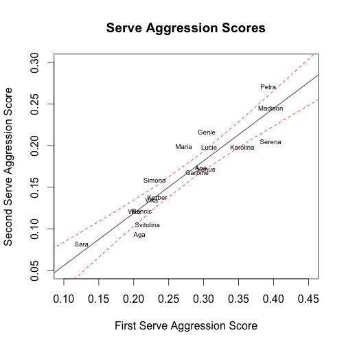
The second and third plots show the relationships between players’ aggression scores on first serves and their aggression scores on second serves for serve and return points respectively as well as the regression lines with confidence intervals.

Figure3

Figure4

The fourth and fifth plots show the relationship between the spread of serve and return aggression scores between first and second serve and the more aggressive point for the player, i.e. first serve for service points and second serve for return points as well as the regression lines with confidence intervals.

Figure5

Figure6


We can take away five preliminary observations.

Sara Errani knows where her money is made. The WTA is notoriously terrible for providing statistics. However, they do provide leaderboards for particular statistics, including return points and games won. Errani leads the tour in both this year. She also uniquely holds a higher Aggression Score on return points than serve points. From this information, we can hypothesize that Errani may play more aggressive on return points because she has greater confidence she can win those points or because she relies on those points more to win.

Maria Sharapova is insensitive to context; Elina Svitolina is highly sensitive to context. She falls outside of the confidence interval in all five plots. More specifically, Sharapova consistently is more aggressive on return points, second serve service points and first serve return points than her scores for service points, first serve service points and second serve return points respectively would predict. She has also lower spreads on serve and return than her more aggressive points would predict.

This result suggests that Sharapova differentiates relatively little in how she approaches points according to whether she is serving or returning or whether it is first serve or second serve. Svitolina exhibits the opposite trend as Sharapova. Considering anecdotal thoughts from watching Sharapova and Svitolina, these results make sense. Sharapova’s serve does not seem to vary between first and second and we see a lot of double faults. Svitolina can vary between aggressive shot-making and big first serves and conservative play. Hot takes are not always wrong.

Lucie Safarova, meet Eugenie Bouchard; Ana Ivanovic, meet Garbine Muguruza. Looking at the plots, it is interesting to note how Safarova and Bouchard seem to follow each other across the various measures. The same is true for Ivanovic and Muguruza. A potential application of the aggression score is that it can point us to players that are comparable and may have similar results. Players with good results against Safarova and Ivanovic may have good results against Bouchard and Muguruza, two younger players whom they are much less likely to have played.

Serena Williams and Karolina Pliskova serve like Madison Keys and Petra Kvitova, but they are very different. Serena, Pliskova, Keys and Kvitova are all players that are known for their serves as their weapons. Serena and Pliskova have the third and fourth highest Aggression Scores respectively. However, they also have wide spreads on serve and return scores and they have much lower second serve service point scores than their first serve scores would predict, whereas Keys is about where the prediction places her and Kvitova is far more aggressive than her first serve points would predict.

While Serena is still a relatively aggressive returner, she rates lower on first serve return aggression than Maria Sharapova. Pliskova falls to the middle of the pack on return aggression. Kvitova and Keys, in contrast, are both very aggressive on return points. My hypothesis for the difference is that while Serena and Pliskova are aggressive players, their scores get inflated by using their first serve as a weapon and they are only somewhat more aggressive than the players that score below them. Kvitova and Keys, on the other had, are exceptionally aggressive players.

The WTA runs through Victoria Azarenka and Madison Keys. Oddly, the players who seemed to best capture the relationships between all of the aggression scores and spreads of aggression scores were Victoria Azarenka and Madison Keys. Neither strayed outside of the confidence interval and often ended up on the best-fit line from the regressions. They define average for the WTA top 20.

These thoughts are preliminary and any suggestions on how they could be used or improved would be helpful. I also must beseech you to help with the Match Charting Project to put more players over the 2,000 point mark and get more points for the players on this list to help their Aggression Scores a better part of reality.

The Match Charting Project hits 1,000!

In less than two years since I first introduced the Match Charting Project and asked for the help of volunteer contributors, we’ve reached a major milestone: 1,000 matches!

I can hardly tell you how excited I am about this. When the concept behind the project was first suggested to me in 2012, I hesitated to act, in part because I didn’t think I could convince enough other people of the project’s merits to build a dataset of this size. I’ve been proven hugely wrong. Even at the beginning of 2015, I figured we’d be lucky to hit the four-figure barrier by the end of the calendar year. Instead, we’ve added matches at a faster pace than ever.


Thanks to MCP contributors, the tennis research community now has access to a standardized dataset of 144,000 points and 580,000 shots. Nothing like this has ever existed in a form that is available to anyone who wants to pursue their own research projects.

I want to take this opportunity to thank all of the 50+ MCP contributors. Special mention is owed to Lowell, who with 141 matches is our most prolific charter and who is a big reason why the WTA is even more extensively represented in the database than is the ATP. I’d also like to single out Edo, who started contributing less than three months ago and has already added 43 matches to the tally, including many Grand Slam finals.

The first 1,000 is, I hope, just a beginning. Please consider contributing to the project–download the spreadsheet and read more about how it works here.

To keep up with the project, you can always find the full list of charted matches here, or a list organized by player here. I plan to post a bit more about the Match Charting Project next week here at Heavy Topspin, as well.